My Textile Story in Colour- A Continuing Journey of Discovery and Progress
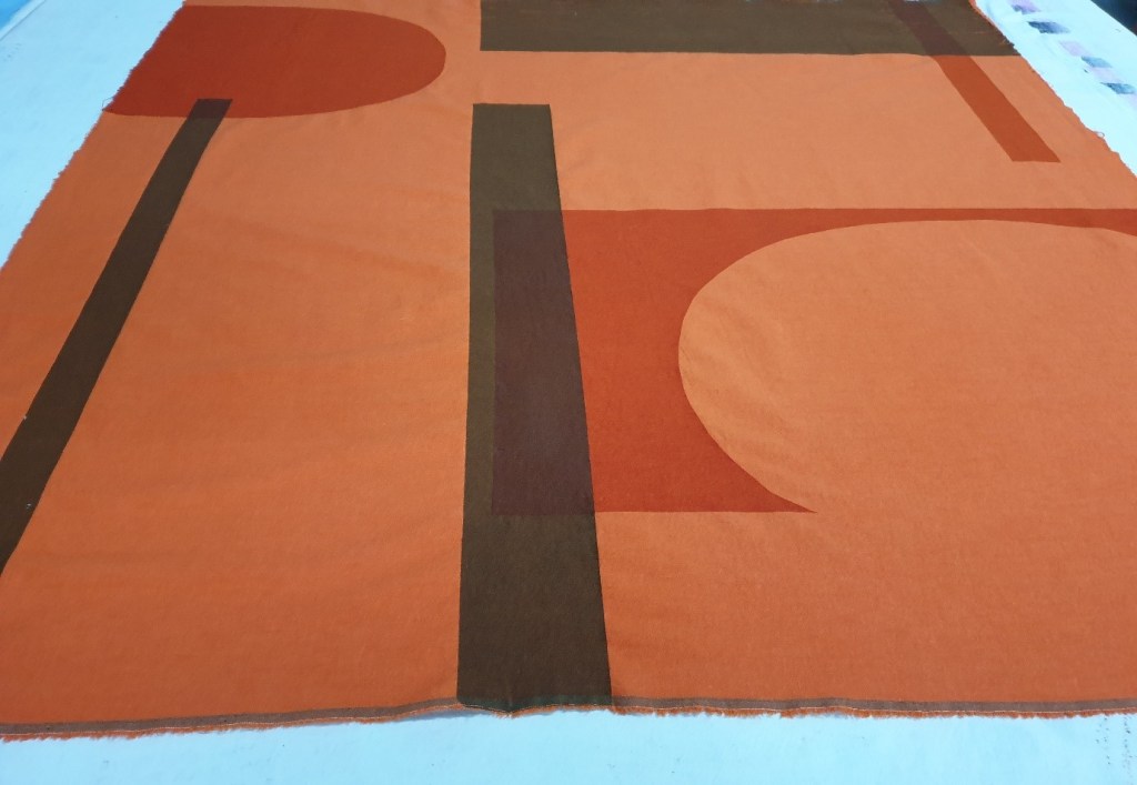
Through reviewing my work, I had the opportunity to see afresh what I had achieved previously and how my screen-printing had developed, of my changing relationship with the placement of shape and line. That said there was continuing use of bold colour choices but more recently this coincided with increased scale and greater experimentation with texture. Through looking at my printed textiles I selected pieces which I liked and represented my journey most from furthest back to more recent works. While I did not necessarily think that all the individual printed textiles which were selected worked as well as they could have, I liked aspects of the layering effects as deemed impactful and meaningful. I focused upon screen-printing as my preferred textile medium alongside a range of other printmaking techniques which often acted as the source material for screen-printing. On reflection I aim to develop my other printmaking techniques more including monoprint, linocut, woodblock and collagraph printmaking as well as heat transfer printing to offer greater diversity of technique in my finished textiles, to optimise the use of such printmaking methods.
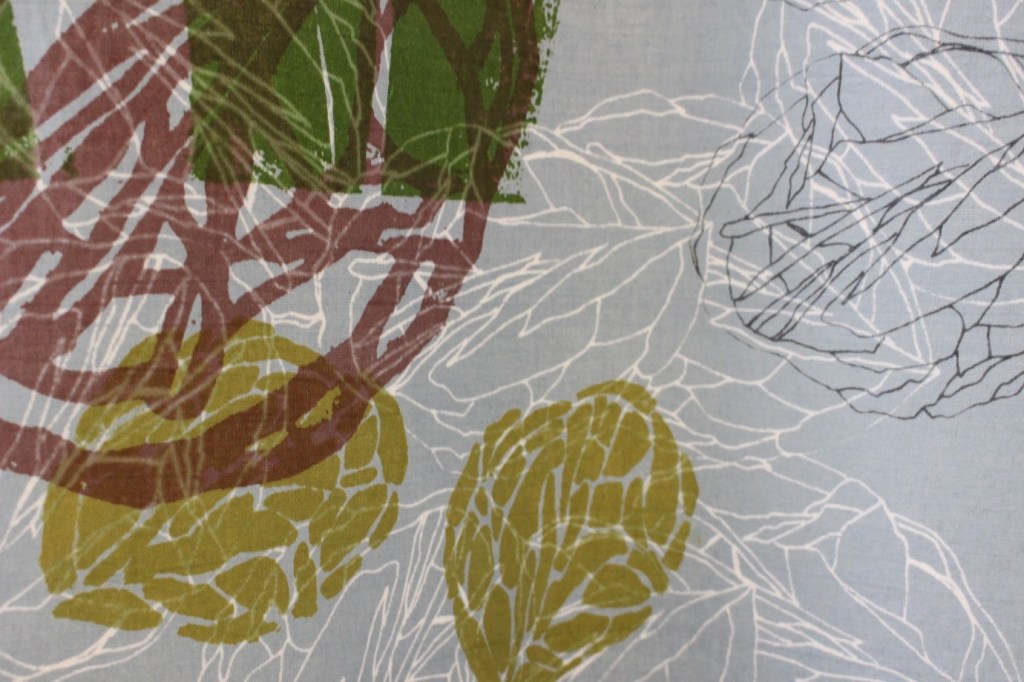
I used artwork of natural forms abstracted which stemmed from relief printmaking. From scanning my original artwork Photoshop was used to manipulate some of the imagery. I focused upon overlaid colour with line and shape on hand dyed cotton as above. I liked to play with the positive and negative spaces of the images on the screens and used hand cut stencils on Kodatrace. I used the interaction of the discharge to produce additional relationships with colour and space. Given my hope to set up my own business and screen-printing studio I have specialised to fully explore colour and to learn the craft so I can develop as a textile designer and artist. In considering the series of project work to date complimentary themes were realised considering the objectives of each individual project centred around hand printmaking processes. My emphasis centred around personal relationships with objects within collections and of creating new relationships and meaning through print. There was always the precise selection of objects with attached relevance.
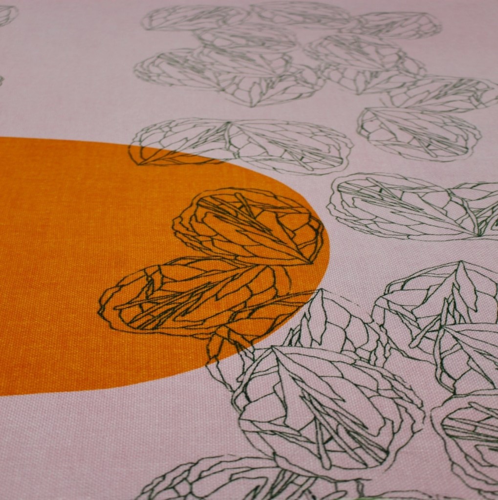
As illustrated above and below this series of printed textiles focused upon bold areas of concentrated colour or black to create added contrasts within the printed linen and cotton textiles. Hand stencils were used to create specific shapes to offset the continuing asymmetrical repeat imagery from my artwork. This worked for the rose stone motif shown with varying degrees of scale, but other samples did not work so well with other imagery. In toning down the colour palette or keeping to a reduced colour range the pieces presented as reconciled. Contrasts were created from the use of both positive and negative space.

I really enjoyed working in larger scale, of covering greater areas of fabric with print while always being mindful of the mix of positive and negative space. I focused upon asymmetrical motif repeat to create new relationships from the natural objects which were meaningful to me from my personal collections. Such collections represented journeys made, experiences felt, and new understandings realised.
The next series of printed textiles explored a greater mix of artwork and photographic imagery using colour and discharge with areas of printed colour. While the clarity of the photographic imagery often aided the quality of the printed textiles more variety of scale was required to improve the overall effect. Increased aspects of the photographic imagery could have focused upon textural elements of the source material and the objects used which would have improved this range below. The colour schemes were exploratory with these sampling processes to see what worked and didn’t work. From reviewing this series, a couple were selected as several of the other printed textiles did not work so well as the colours were too jarring and less resolved. That said I thought the natural objects in colour and discharge highlighted the beauty, uniqueness and fragility of our natural world. The juxtaposition of such imagery in colour and discharge also highlighted the past and present, as well as life and death, to represent a rapidly disappearing natural world.

This process helped me to highlight the significance of such objects in a new way, to promote their importance beyond printed textiles, for others to see the beauty within natural forms, in nature, of the value of our natural world, to advertise a world worth keeping. Such themes then started to permeate my creative process, to use objects from collections to highlight such significance. While such objects can have personal resonance to me they have importance in their own right, of the need to utilise objects or aspects of objects to say something, to communicate their importance through print.
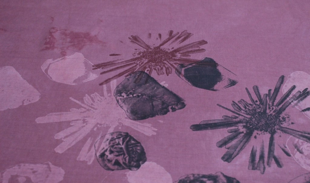
From such developments there was a clearer direction in my screen-printed textiles concerning undelying thems, the bold use of colour with increased scale from my original artwork and hand printing. Considerable preparation was required overlaying imagery before choices were formalised. I increasingly created contrasts with colour and texture through placement. The inter-relationships of shape and line coupled with the interactions of discharge and colour produced interesting outcomes, which continued to foster further investigation. Increasingly aspects of natural forms were described in detail in print.
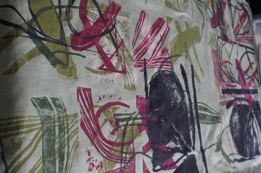
Hand printed artwork from drawings of crystals, rock, stone, shell and fossils created a range of marks which were overlaid to cause interactions of line, colour, shape and texture. As illustrated previously increased scale, printing inks and discharge paste was used on hand dyed cotton to highlight the beauty of natural forms as the primary source material.


The next preferred series of printed textiles evolved from personal archives centred around my families origins and local history including the Romans. Man-made and natural objects from national collections were used as source material alongside photographic research and artwork from relevant site visits. Numerous objects were studied and photographed from the Huntairan Museum, Glasgow and the National Museum of Scotland, Edinburgh to ensure relevant objects could be seen through the series of four large textile wall hangings or textile archives. There was a mix of imagery used which interlaced my own historical narrative but also there was a story being told throughout each textile archive which was pertinent to the local area, of the significance of the Romans in Scotland and beyond. The inter-relationship of the imagery with line, shape and colour sought to produce a different way of seeing history, historical events and documents. The use of text with photographic imagery and artwork produced interesting ways to interpret and understand the past.
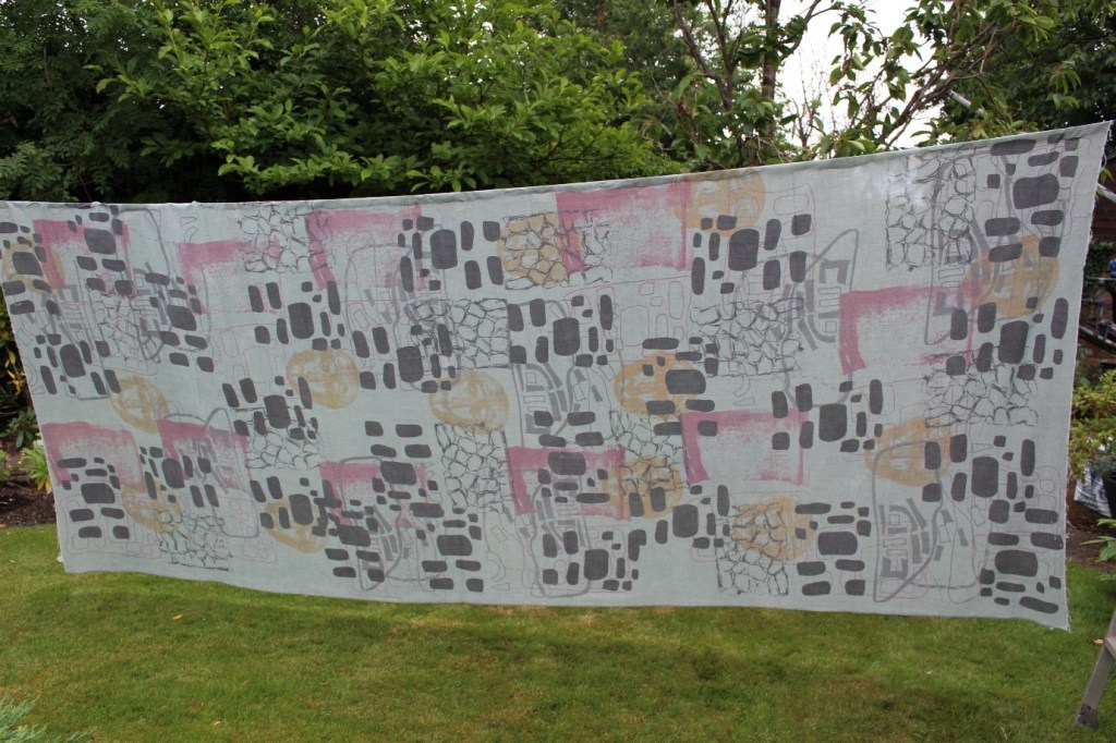


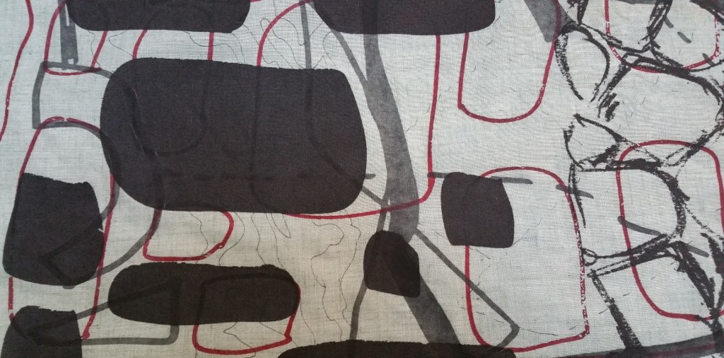
The contrasting use of black and red shapes from the Roman defensive pits, the hand drawn charcoal sketches of textured line to represent the Antonine Wall, old mapping symbols from the Roman sites in grey with significant Roman artefacts found locally were overlaid to draw together and illustrate the historical past. Through such imaginal story telling of the past in new and contemporary ways to create textile archives materials have been used to communicate new ways of seeing and understanding experiencing that went before.
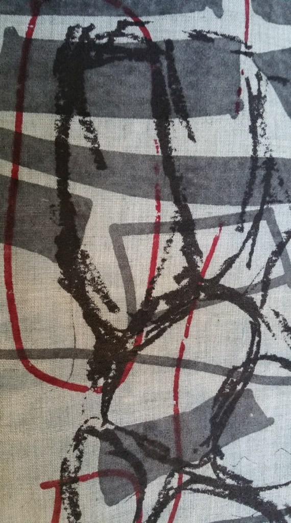


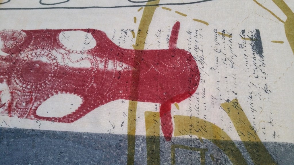
While blocks of grey was used throughout this was meant to offset the use of colour elsewhere on such a large piece. The strong blocks of grey however became a feature itself which overshadowed some of the imagery used. That said elements of the wall hanging worked very well with the mix of colour, text, mapping symbols and Roman Chamfron.

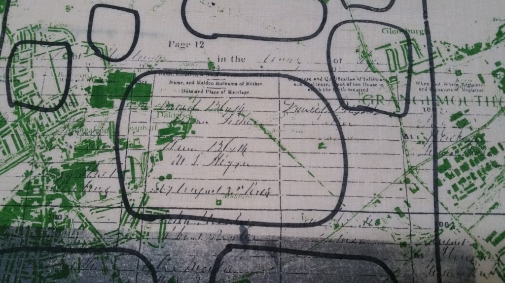
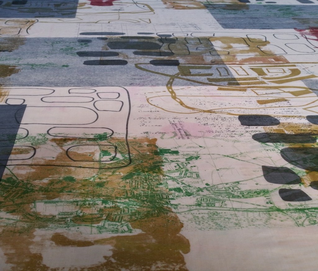
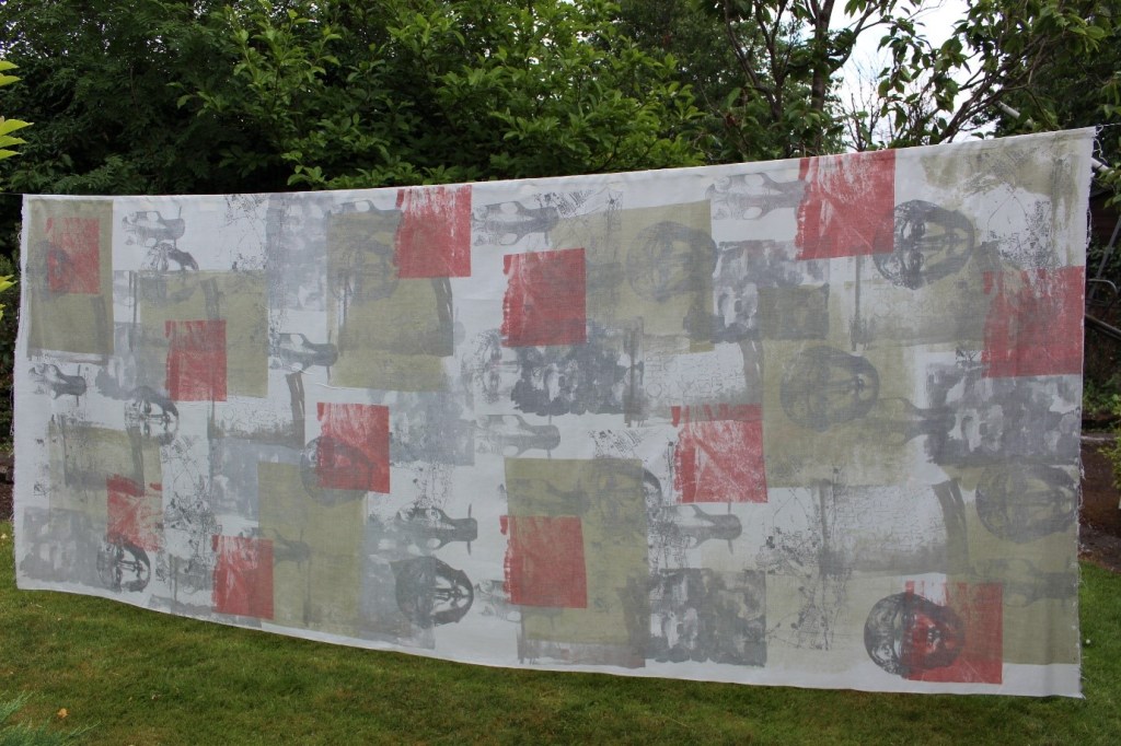
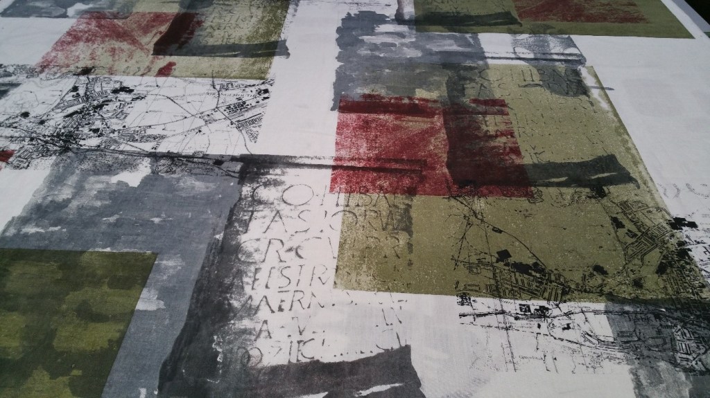
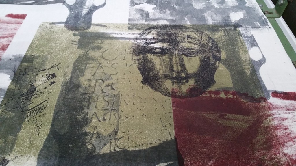
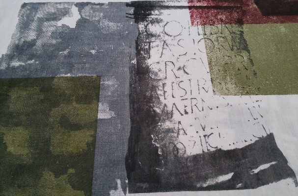

From the selection of colour schemes used some wall hangings proved to be more successful. Using more muted tones with one more dominant colour seemed to make the overall imagery gel as a whole more readily including the use of grey and black with olive green and oxblood. The background blocks of olive green hung together with the photgraphic landscaping of the Roman sites in oxblood. The colours in themselves represented so much more given the green landscapes of the area and the battles which ensued. Although the textile archives were not all entirely successful I learned so much from the process which has been carried forward into other project work.

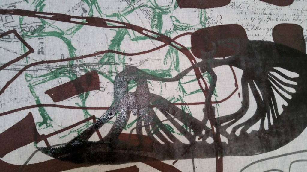

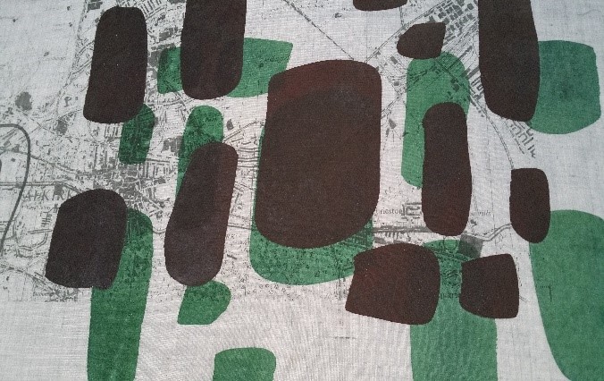

From the imagery included from a range of cross-sections from the textile archive wall hangings the inclusion of personal Roman artefacts worked particularly well especially the Roman shoes. Such use of objects with personal meaning and resonance reiterated one of my key underlying themes, of using objects that evoke a response, that elicit a reaction and ultimately mean something and have something to say.
The next series of printed textiles was increasingly scaled up and abstracted further from the earlier source materials including personal archives. Considerable artwork was undertaken to abstract further what had gone before. There was continuing exploration of colour with line, shape and texture. Reflecting upon such work I can relate to them as a series of colour studies or samples to examine the interactions of colour with a variety of imagery. Further abstraction of the core imagery made the underlying themes and narrative more indistinguishable but more interesting and not so obvious. What the textiles were about now needed to be located so looked at for longer producing more of a relationship with the viewer and the textile art. In being more experimental with the use of colour, hand stencilling on the screen and the fabric more depth and interest was created within the textiles as they developed in their complexity and design on hand dyed cotton, linen, silk and velvet.
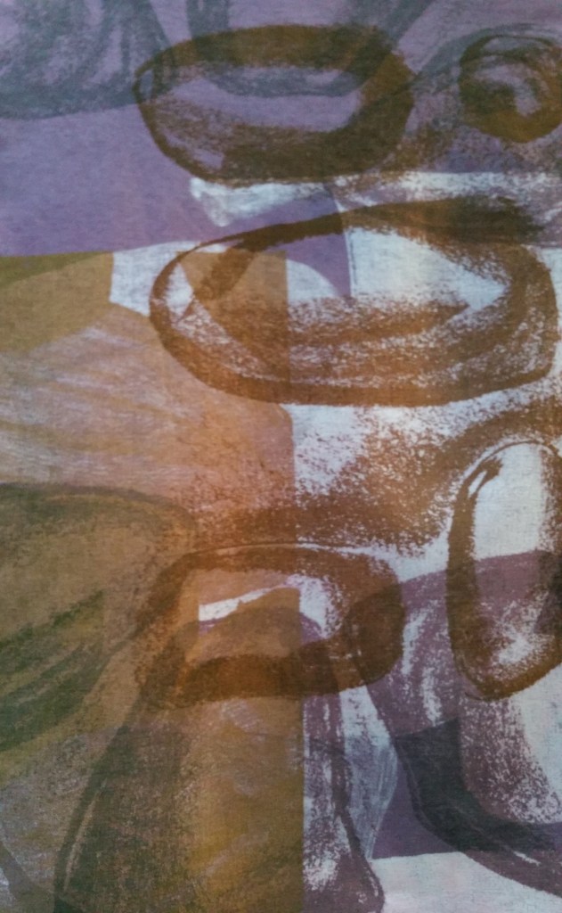


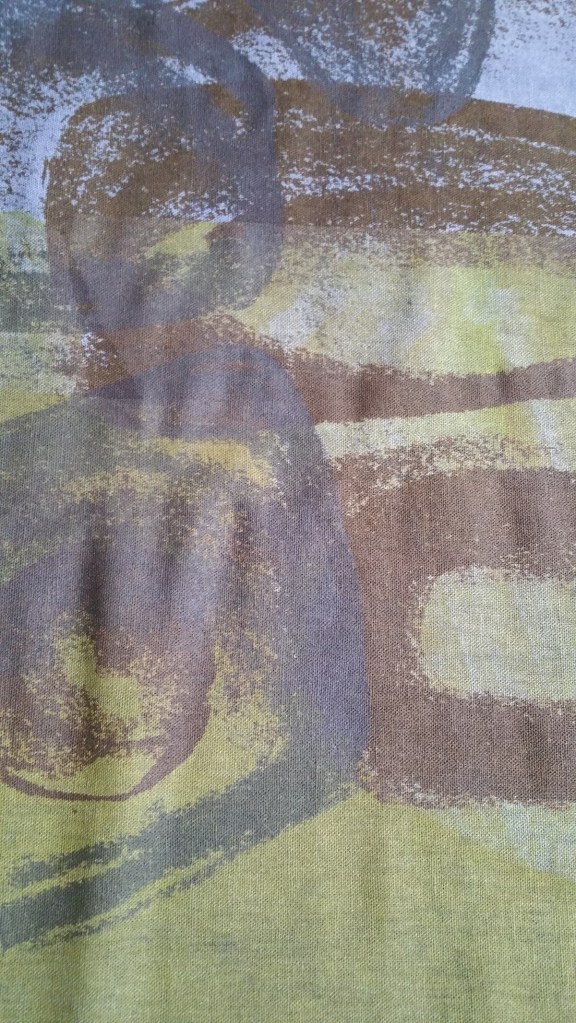
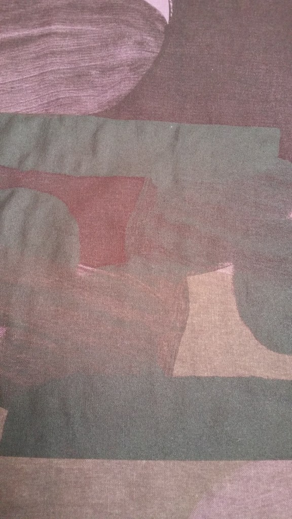
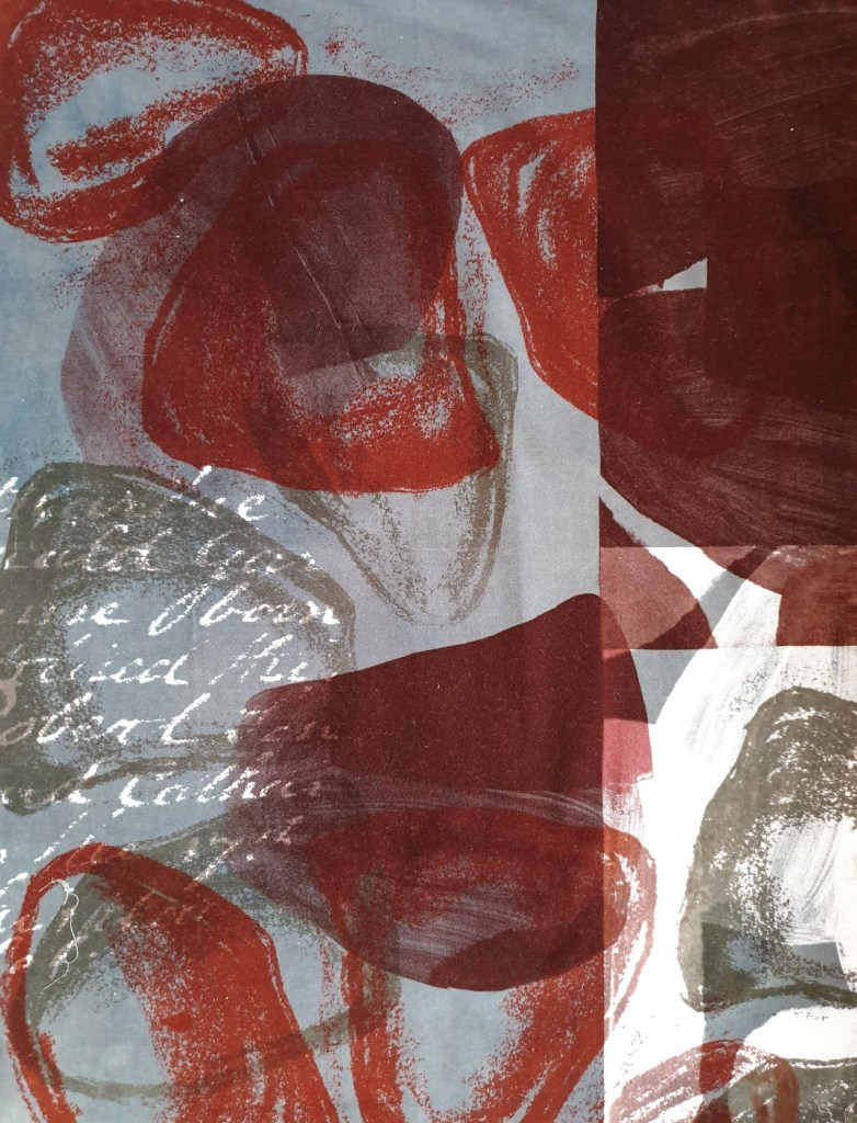
The examples above and below highlighted a step on with the increased use of complex layering and stencilling especially on velvet. The use of stark colour contrasts of oxblood, rich orange and grey with discharge produced effects which I went on to explore further. I felt that this scale of abstraction worked well with my core narrative of representing meaningful and relevant objects from collections in unique and contemporary ways, to illustrate journeys made and to raise awareness of something existential that matters. More reconciled printed textiles were realised from this series of larger sample work. There was as much emphasis on the use of positive space as there was on the use of negative space. Increasingly the printed textiles represented story telling using a range of aspects of natural objects, of taking elements of their surface line, texture and form and re-envisioning through colour alongside parts of the personal archive. There were connections with and inter-relationships to the family’s strong association with the sea, of the object’s evolution and connection with the sea, of the need to recreate such associations in the textile work to focus upon my own identity and current related issues.


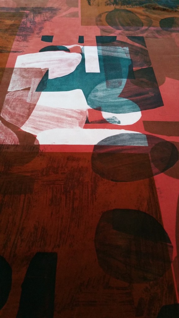
More recent screen-printed textile work has been stripped back further to contrast the outlines of shapes with marks made to replicate areas of natural forms using rich orange and mid-blue on hand-dyed baby blue cotton velvet. The core prevailing colour work continues to link all textile work, to use colour to illustrate imagery alongside line, texture and shape. The increased simplicity and scale with colour represent current trends in my use of screen-printed textiles.

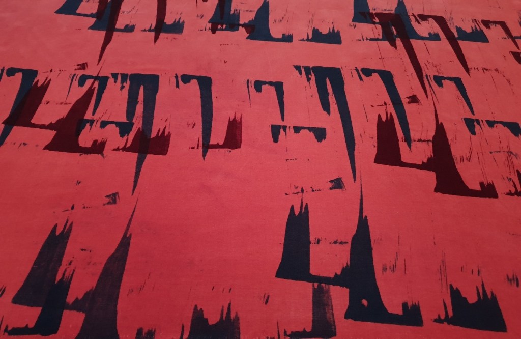
Within the last few weeks there has been further exploration of colour with shapes using hand cut stencils on hand-dyed linen. The use of bold colour statements continues to be explored within these unfinished colour works with shape and discharge to further expand my own personal narrative with existential themes.

