

Given the onset of Coronavirus, social distancing and staying at home during my time away from work… I recognised the need to undertake hand printmaking from home within a smaller scale format. I decided to utilise what I had available from home. I adapted my relationship with printmaking and was increasingly led by the materials used, to leave myself increasingly open to what happened in process, to purely respond to such outcomes more. From the outset I researched options and possibilities using heat transfer techniques including the use of the textile handbook by Dawn Dupree. See sampling examples below/ next page. I have been influenced by her use of colour, composition, layout, and materiality, of the way she lays down print and builds up layers with the placement of imagery.

Morris (2020) Monoprinting-Textural mark making to emulate the beauty of fragility in natural surface qualities. My own mixed range of artwork has been increasingly used within heat transfer printing to add different areas of interest to the polycotton in use.
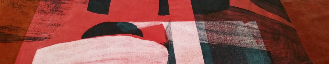
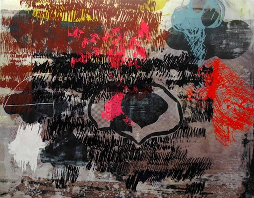
I have particularly liked the textural work of Dawn Dupree with her use of overlaid colour. The unique mark making coupled with the use of line and shape I can readily relate to. In Turbulence (2009) the arrangement and placement of areas of colour and texture creates an impactful range of contrasts within the one overall image. I also appreciate her relationship with the imagery used and I utilise and integrate imagery within my own printmaking processes which mean something to me, and others and it has something to say.
I became increasingly interested in how I could layer a range of varying imagery from different sources to integrate my artwork, areas of colour and line with textural qualities, to utilise source imagery and text from my research processes within the layering process to evidence my context in a multi-faceted way. Natural forms continued to influence line, texture, shape, and colour to express the beauty of fragility, of the need to capture something of that fragility to convey what my creative practice says and means.


The use of empty space seemed as important to me as overlaid imagery, of thinking about presence with this sense of emptiness coupled with sustainability and waste. Of the different use of line in its many forms from faint and fading to distinct and prominent to capture the essence of nature’s struggle to survive.
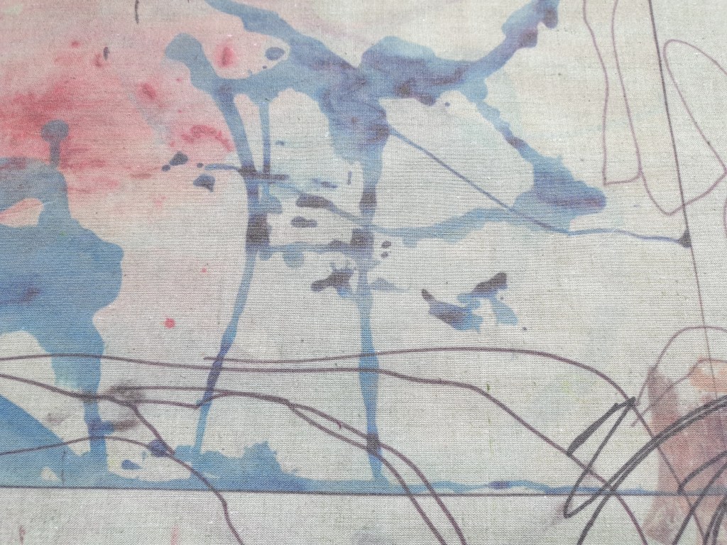

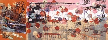
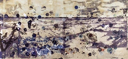
For part of the sampling process for the visual pre-collection work concerning printmaking and the use of scale, colour, line and texture I used six metres of reclaimed polycotton fabric which I hand-dyed in a number of colours and cut up into sections. I then cut the material into thirty-six A3 sizes to allow enough scope for experimentation. From this I generated a collection of context-based brief narratives of the beauty of fragility in natural forms through continuing environmental threat.
