
There is a continuing focus on painted ‘texture’ as one of my most important textile design elements alongside line, shape and colour. Surface textural effects and innovative creative practice go hand in hand for me as it is often the basis of my hand printmaking processes. Although I have the capacity to generate and transform imagery through Photoshop and desktop picture and text editing facilities including photo-editing software I prefer to use my own artwork as the basis of my textile work, to sketch, draw and paint the original source material. I have selected as my initial inspiration a range of natural forms, surface qualities and pattern including stones, crystals, rock features, shells, fossils and numerous coastal materials. I am often attracted to coastal objects given their environmental significance, of their fragility coupled with their beauty, of their unusual and interesting outer layers and coatings along with their unique colouration. Therefore, the colour studies focused upon the preferred parts of the surface quality of a range of objects to best illustrate the overall fragility of such objects and their immediate environments.
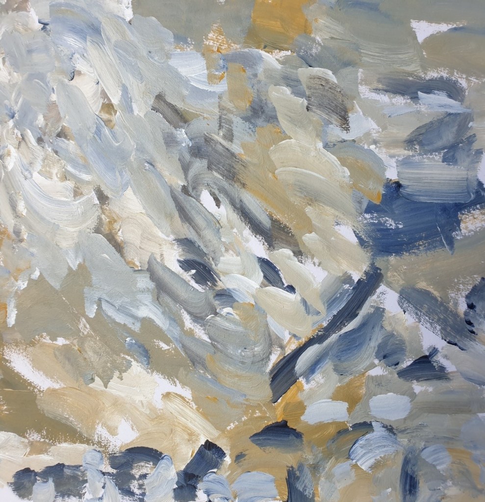
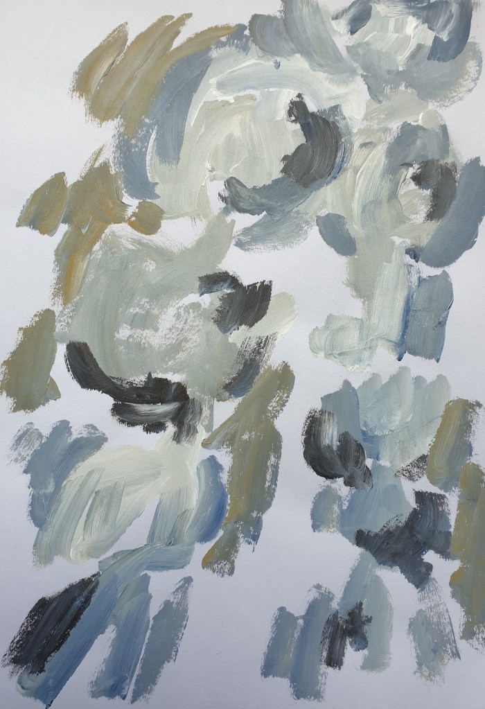
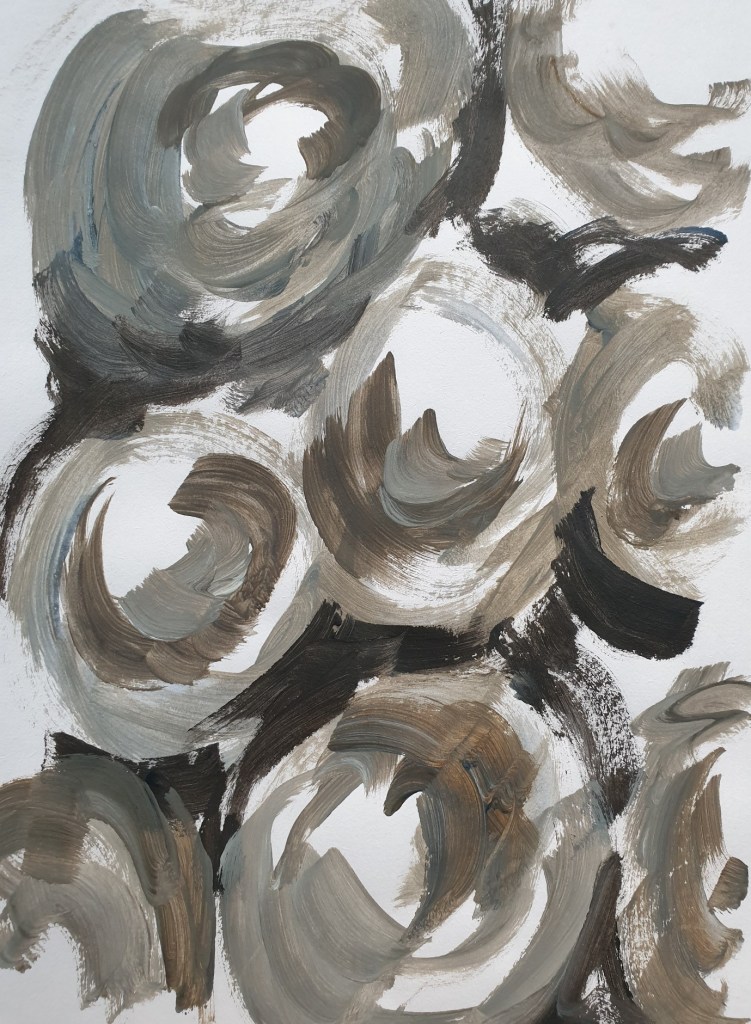
I have enjoyed continuing to investigate colour and texture through acrylic paint as it is so malleable with and without water, to play with the textural qualities and interplay of colour. Through painting either on an assortment of paper and card or directly into a sketchbook more ideas are generated. As I paint, I am reflecting upon layering in print of the options and possibilities of painterly marks above or below other mark making. I also think about scale…of various scale large and small on several different prints and on the same print. Throughout I am taken up with how the painting and paint effects make me feel, what emotion they evoke, of the need to communicate degrees of fragility, of a sense of brittleness to match the capacity to readily break and fracture such objects.
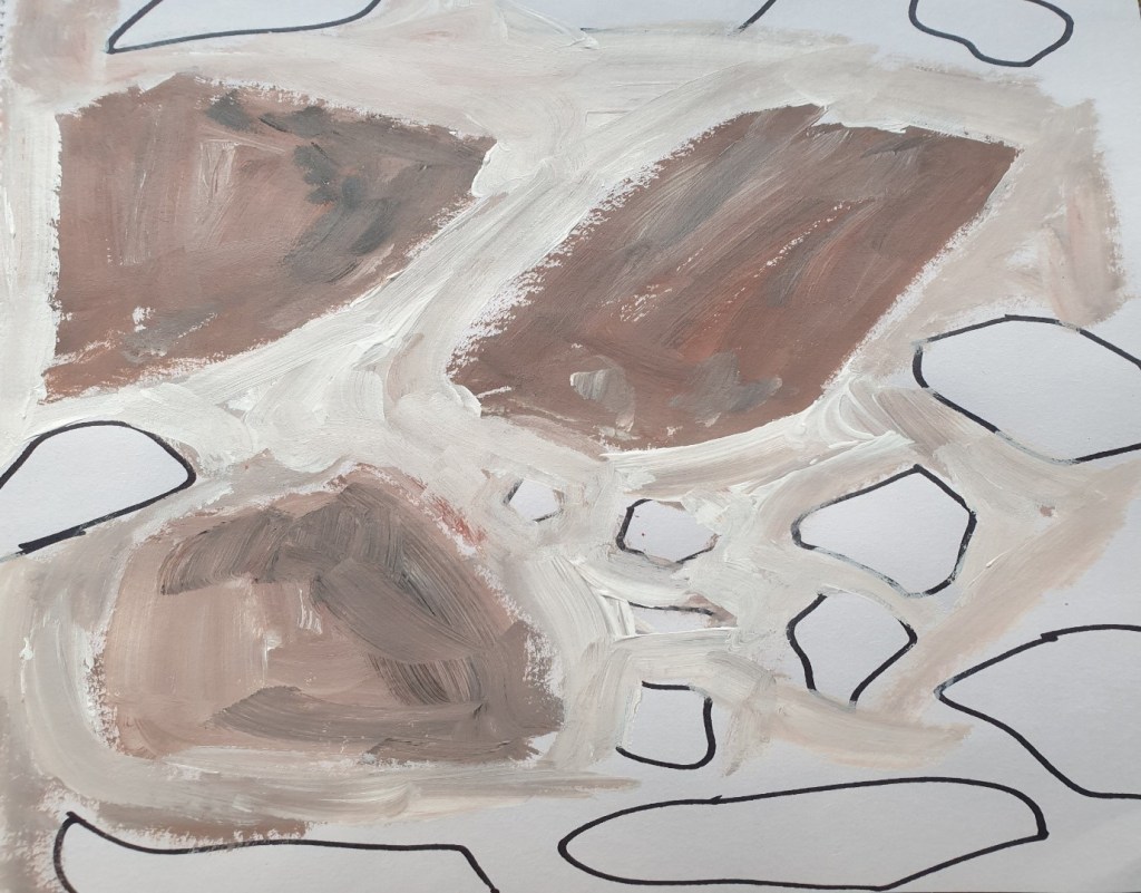
It was more of a challenge to convey the shells brittleness alongside the beauty of their surface patterns, of painting in a sketchy way to lighten the overall effect which more aptly represented their exquisite exteriors. From doing so I started to think about such beauty within the threatened marine and coastal habitats, of such fragile ecosystems being dredged, fractured and broken.
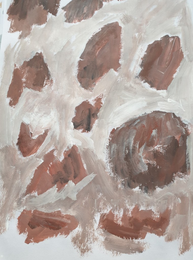
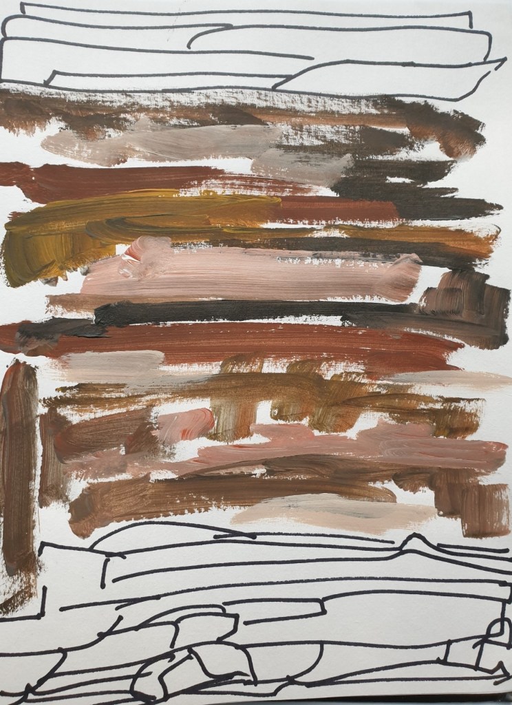
From painting a range of rocks and stones I particularly liked the use of specific colourways centred around burnt sienna, brown ochre, burnt umber with touches of black or Payne’s grey with white. I thought about the use of such colours within several of my forthcoming printmaking processes. From this ongoing investigation into painting textural elements with a range of colour schemes I have learned more about my preferred effects and colourways for print.