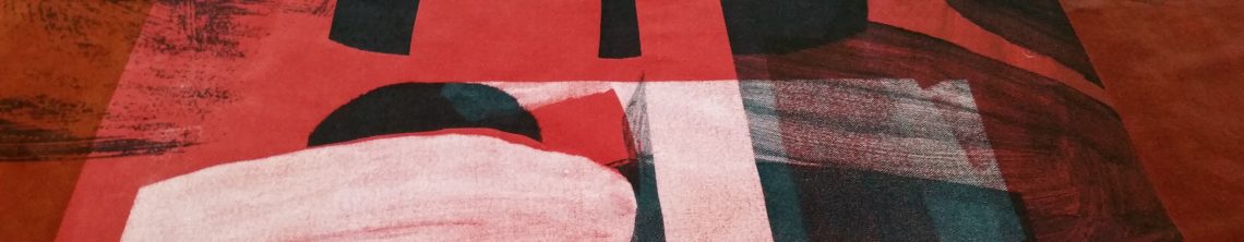


Given the onset of Coronavirus, social distancing and staying at home during my time away from work… I recognised the need to undertake hand printmaking from home within a smaller scale format. I decided to utilise what I had available from home. I adapted my relationship with printmaking and was increasingly led by the materials used, to leave myself more open to what happened in process, to purely respond to such outcomes more. From the outset I researched options and possibilities using heat transfer techniques and methods including heat transfer papers, pen and paints with the help of core text by Dawn Dupree. I became increasingly interested in how I could layer a range of varying imagery from different sources to integrate my artwork, areas of colour and line with textural qualities, to utilise source imagery and text from my research processes within the layering process to evidence my context in a multi-faceted way. Natural forms continued to influence line, texture, shape and colour to express the beauty of fragility, of the need to capture something of that fragility to convey what my creative practice says and means. The use of empty space seemed as important to me as overlaid imagery, of thinking about presence with this sense of emptiness coupled with sustainability and waste. I used six metres of reclaimed polycotton fabric which I hand-dyed and cut up into sections of each colour then into thirty-six A3 sizes to allow enough scope for experimentation.

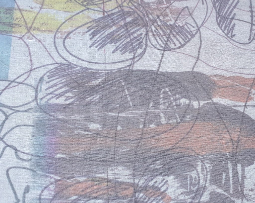
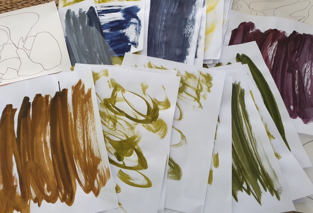
I selected some artwork that I had used previously in screen printing processes alongside completing new artwork using acrylic and watercolour paints, heat transfer paper, paints and pens with marker pen and ink as illustrated. I enjoyed using the mix of imagery which lent itself to endless options. Through repeating similar printmaking processes, I worked out how to print different variations of line, of altering the strength of the line, of fading effects to making bolder statements with line both directly using heat and through the print processes with applied pressure. Through this learning I understood what I could do and achieve which enabled me to increasingly experiment through drawing, painting, and mark making on loose-leaf paper and card as it was used in the heat transfer process.
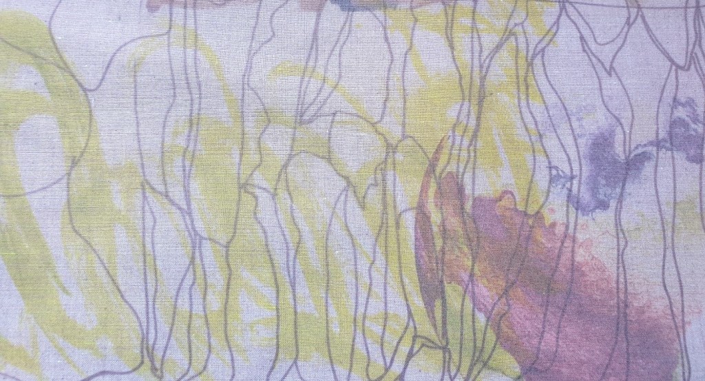
I experimented with the paint effects from my artwork and the heat transfer paints to know what to do to achieve a range of colour effects. Eventually I was able to understand the colour mixes. Through the sampling processes I was able to mix less vivid and more subtle ranges of colour through my experience of colour mixing. I built up initially brighter tones which were used to help offer contrasts. This hand printmaking process enabled me to realise how much I relished playing with colour and the merging of imagery, of using line and shape with texture to create unique one-off textile statements to promote the context in which I work. For me, this related to the process of developing narratives in print, of creating a series of images to communicate a message as in campaign posters in textiles.
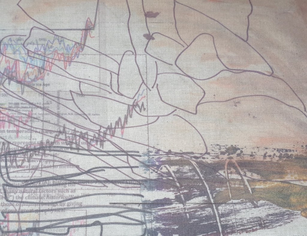
This trial and error approach lent itself to greater degrees of experimentation, of layering both complimentary and jarring imagery to create thought provoking groups of overlaid visual narratives with associated aesthetics. Given this process the layering of imagery produced a range of outcomes. When the group of imagery resonated with what I was trying to communicate it went well and it made sense to me. That said there were many occasions where the collected imagery of the A3 pieces of polycotton did not represent a cohesive whole and instead it was disjointed, messy and too difficult to identify and read. Too many overlaid images, colours, textural detailing and line with shape led to confusing end results. Nevertheless, a lot of learning was gained along the way which lead to more thought out visual placements, arrangements of artwork-colour with texture and painted natural surface qualities and forms set against pen and ink natural outlines. How all the different media and processes including resources were brought together through layering was fundamental to the outcome.


it is a brilliant post thanks Good bless
https://impactdigitizing.com/
LikeLike