Project 2.1-2.3 Visual Pre-Collection Work- Scale, Colour, Line and Texture
Visual Exploration-Sampling Processes
Printmaking and Tapestry Weaving
Assignment 2 Learning Log in conjunction with my online blog www.weaveprint.com
Gillian Morris Student No 511388
Visual Starting Point- Evaluation of Prior Sampling and Follow Up from Assignment 1

Introduction-Original Sampling Processes-Screen printing
Use of linear artwork and textural mark making inspired from natural surface qualities
Three metres of hand dyed upholstery linen from end of roll surplus was previously used for the sampling processes from Assignment 1 Project 1.4 Keep Moving- New Work-New Directions in Textile Work Processes to help connect and communicate. The original source material and artwork which investigated environmental sustainability through natural surface qualities was used which focused upon creating opportunities to investigate the key themes of the beauty of fragility in nature. The colour palette was led by experimentation through the application of a range of colour mixes. One metre of the linen was dyed in each of the colours… olive green, smoke grey and deep plum and all were dyed by hand in large receptacles. The dyed linen was cut up into a series of A3 sizes to enable sampling across different colourways to produce a series of samples. Each series comprised numerous A3 samples with a mixed colour range.
During the screen-printing process different techniques were trialled to produce variable outcomes. I felt that it was a dynamic process as it was immediate and intuitive working directly with the linen. I was fully engaged within the screen-printing process, of comparing different groups and the overall effects. I worked on developing more of a personal relationship with the application of colour and how such colours were seen against different textural mark making backgrounds, line, shape, discharge, drawn stencilling and hand cut masking, of how the colours, shapes and line interacted…so many inter-relationships were explored. I was drawn into the melding and fading of colours alongside the variability of textural marks used… intuitively working with the fabric and its properties. I was conscious of being led by how the linen responded to the reactive dyes and the overlaid colours, of the interplay of material and myself which led onto realising preferred colour schemes. The oxblood, deep turquoise and light grey worked well on the smoke grey coloured linen. The discharge shimmered against such a colour scheme and the colours complimented each other given the mark making within the masked off areas. The sampling process enabled me to select a few preferred colour schemes for my larger scale work given how the colour and mark making had interacted with each other. Ultimately, I selected from the samples which emotionally resonated with me most, which increasingly portrayed this sense of beauty and fragility within the print. The less successful prints had fewer areas which illustrated such desired themes and offered reduced contrasts with areas of interest and impact.
On reviewing my A3 sample range, I felt that I had achieved several positive outcomes which evidenced that such imagery could be used successfully on a much larger scale on the same upholstery linen. That the continuing colour applications on the linen produced enough light and shade, variation, substance, overlapping and layering to create complex, impactful and unique printed textiles. That said the beauty of fragility continued to act as an inspiration for my making, to further cement the fragility of the environment and the fragility of my imagery, to convey the vulnerability of such natural forms, of aspects of natural surface qualities and the creative process which has been set against the strength and robustness of the linen used. The aim going forward was to continue to capture such fragility within the imagery but to be bigger, bolder, more dynamic and to take more risks with the screen printing processes. In considering the knowledge gleaned from working on upholstery linen including the preferred colourways and techniques I felt adequately equipped to increase the scale of the imagery beyond what I had worked on before.
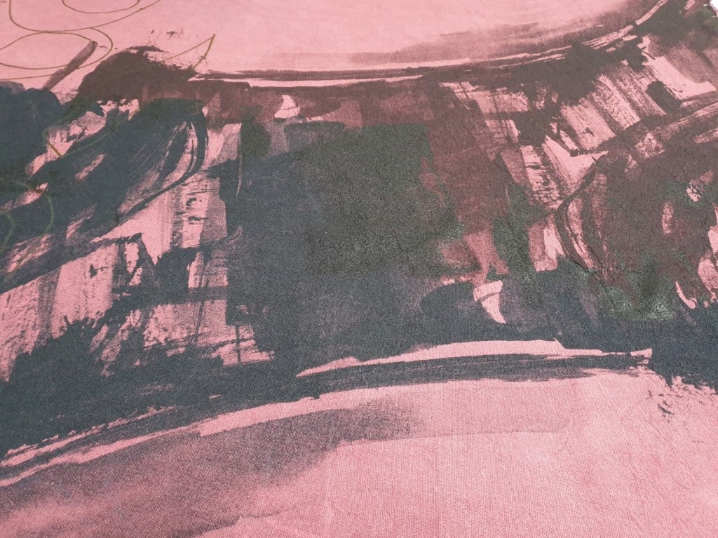
Larger Scale Screen Printed Sampling- Visual Exploration through Extremes in Scale, Colour, Shape and Texture to Create Fragile Interactions from Nature In pulling together my artwork, past learning from prior sampling, skills development through repeated practice and my knowledge and understanding of the relevant processes I felt creatively prepared to work in a scale that was much larger, to experiment further with ways to express what I wanted to say through the artwork used. I focused upon creating three exceptionally large, screen-printed samples using five metres of dyed upholstery linen from end of roll surplus. The imagery was scaled up using 1200dpi on Photoshop to maintain a clear resolution through exposure onto the screens and in print. When scaling up the imagery time was taken to increase and translate the design accurately. Half tone prints were sought through Photoshop to enable a greater sense of detail and delicacy within the imagery. The juxtaposition of the heavyweight upholstery linen which was 766 grams per square metre with the delicate layering of print initially centred upon texture, line and colour helped to exploit the physical properties of the cloth. This visual investigation enabled greater exploration of space, of the effects of all or parts of the imagery through hand cut stencilling and masking off. Increased themes of subtility, delicacy and fragility were realised through experimentation with the imagery on the linen. The use of stencils and masking off areas emphasised a textural brush mark or a drawn line for example. The careful interplay between layers of print highlighted seeped through elements from a layer beneath, to work with and collaborate with the material and its range of possible responses. The ideas invariably evolved from being in relationship with the material through time with good effect. See images of Enveloped- A Personal Response to Natural Forms in Crisis (Morris 2020) in process below to highlight the layering of print, the materials response to the printing process, the interplay of texture with colour including the scale of detailing and the effects of specific areas of textural mark making overlaid.
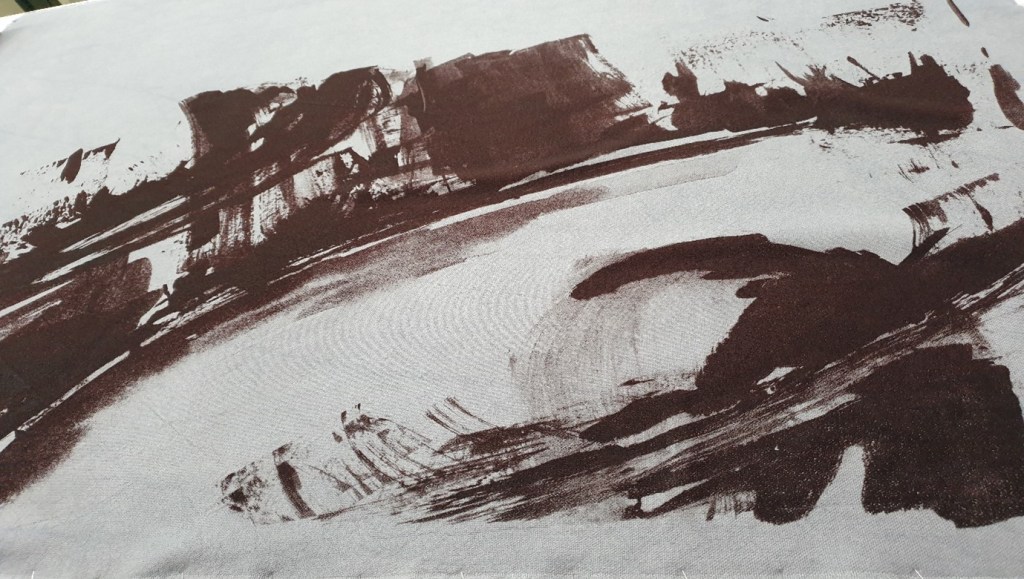


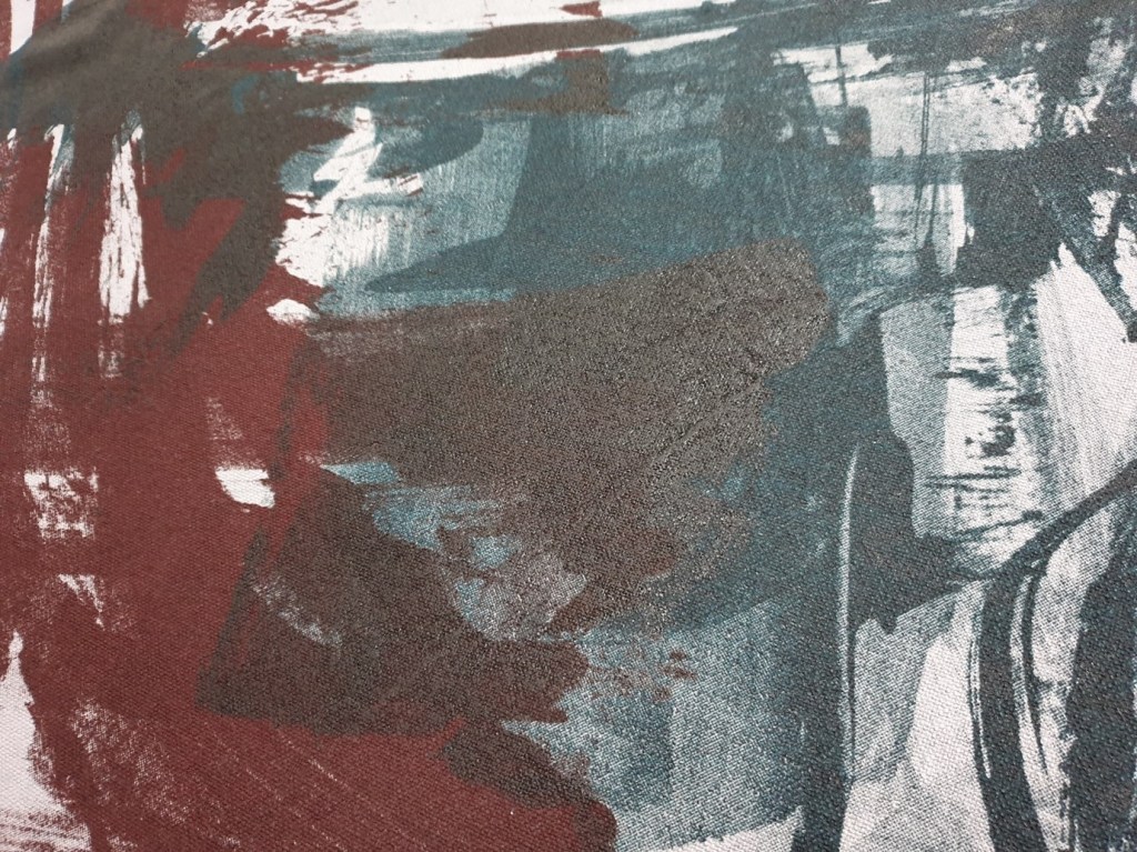

Through this sampling process I was able to see what worked best, I was struck by the effects created through masking off sections to accentuate the interplay within specific areas. In examining the imagery with the linen, I created more of a relationship with making. In-process I analysed the placement and layout of imagery by first using the acetates which held the imagery over the linen then I reviewed each print, how the degree of pressure and the number of pulls had interacted with the material and image printed before taking the next step. I investigated how a line related to a mark to the material in use. In doing so I developed more of an emotional response to each sample…which enabled me to create ways of working to and with textiles that had not been experienced before. I was influenced by presenting the imagery from natural forms in the best light given the context. I felt my work was driven by movement like nature and action for change, of having a sense of not standing still coupled with vulnerability and fragility which I wished to carry forward in my textile practice. Continued use of the hand dyed heavy upholstery linen seemed to fit the context of my work well alongside its material properties, of the ability of the fabric to hold its colour, to give strength to the imagery considering its depth and meaning. The heavy weight linen offered a robust surface to print onto to enable the layering of print. The linen draped well, failed to crease readily, and did not distort. The linen evidenced increased durability throughout the printing process which juxtaposed well against the beauty of fragility. The upholstery linen showed all the nuances of the print which emphasised the beauty of fragility within natural surface qualities and supported its continued use for the larger scale work as even the faintest of mark and line was evidenced clearly and crisply.



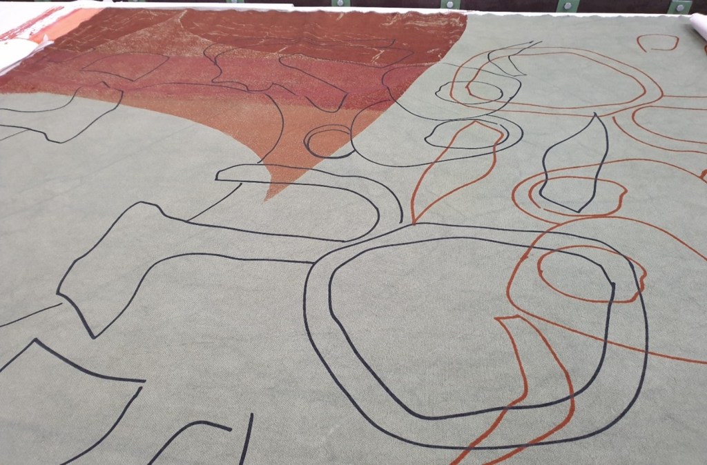
See images of Inter-relationships- A Personal Response to Natural Forms in Crisis (Morris 2020) in process. During screen printing there was a greater emphasis on the natural line than on texture with colour, to offer a contrast within this series of larger scale imagery and to capitalise upon the beauty of line. While elements of textural mark making were investigated within defined and masked off areas the beauty of the natural line took centre stage. The overlapping natural shapes and outlines could be seen uncluttered for their own sake. Within the defined and masked off areas the material was played with in altering the number of pulls and pressure exerted using deep orange. Blank frames were reused to capitalise upon textures created within the screen. The crispness of the line contrasted well with the elements of textural mark making. The natural outlines from scallops including barnacles showcased the beauty of the natural forms coupled with its fragility.

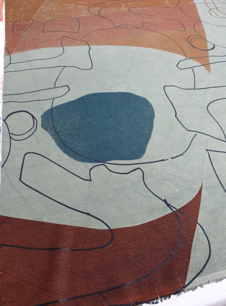
Although there was an initial impulse to add more to Inter-relationships: A Personal Response to Natural Forms in Crisis (Morris 2020) I fought against this urge to overladen the upholstery linen with imagery as I also wished to highlight my relationship with the linen and the spaces in between the natural outlines and shapes, to have a balance between what can and cannot be seen. The area of deep turquoise enabled enough contrast within the areas of colour and texture used to complete this printed narrative.
On reviewing the labour-intensive process, the screen sizes were much larger to what I was accustomed to using and were hard to handle. Support was required when printing as each screen size was 168cm x 117cm and 147cm x 122cm which meant greater care was required throughout the creative process. Screen printing became a very physical process through increased scale, weight and size which meant there was greater engagement mentally and physically throughout the screen printing processes with the upholstery linen. There seemed to be a greater degree of focus, immersion, and immediacy during the creative process as the upholstery linen helped to lead the way as each step was dependent upon how the material responded to the print which then influenced what happened next.

What next? To extend my use of materials within the screen printing processes, to utilise increased relating with textiles, to capitalise upon end of roll surplus, reclaimed fabrics, to reuse more unusual textiles as appropriate to availability to challenge and stretch myself further beyond my comfort zone. To increasingly convey and communicate the context of my creative practice from material use to source imagery and artwork.
Further experimentation using a range of printmaking processes including heat transfer techniques and mixed imagery
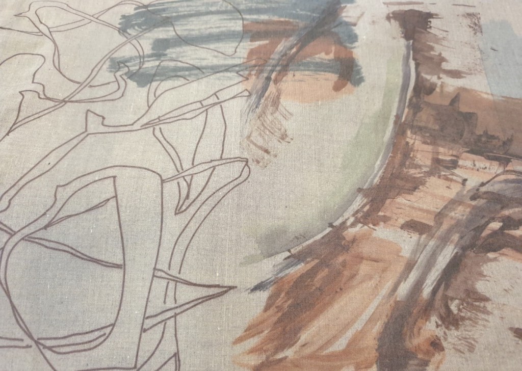
Given the onset of Coronavirus, social distancing, lockdown restrictions and staying at home during my time away from work… I recognised the need to undertake hand printmaking from home within a smaller scale format. I decided to utilise what I had available from home. I adapted my relationship with printmaking and was increasingly led by the materials used, to leave myself more open to what happened in process, to purely respond to such outcomes more. From the outset I researched options and possibilities using heat transfer techniques and methods including heat transfer papers, pens, and paints with the help of core text by Dawn Dupree. I became increasingly interested in how I could layer a range of varying imagery from different sources to integrate my artwork, areas of colour and line with textural qualities, to utilise source imagery and text from my research processes within the layering process to evidence my context in a multi-faceted way. Natural forms continued to influence line, texture, shape, and colour to express the beauty of fragility, of the need to capture something of that fragility to convey what my creative practice says and means. The use of empty space seemed as important to me as overlaid imagery, of thinking about presence with this sense of emptiness coupled with sustainability and waste. I used six metres of reclaimed polycotton fabric which I hand-dyed and cut up into sections of each colour then into thirty-six A3 sizes to allow enough scope for experimentation.
I selected some artwork that I had used previously in screen printing processes alongside completing new artwork using acrylic and watercolour paints, heat transfer paper, paints and pens with marker pen and ink as illustrated. I enjoyed using the mix of imagery which lent itself to endless options. Through repeating similar printmaking processes, I worked out how to print different variations of line, of altering the strength of the line, of fading effects to making bolder statements with line both directly using heat and through the print processes with applied pressure. Through this learning I understood what I could do and achieve which enabled me to increasingly experiment through drawing, painting, and mark making on loose-leaf paper and card as it was used in the heat transfer process.

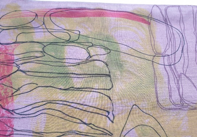
I experimented with the paint effects from my artwork and the heat transfer paints to know what to do to achieve a range of colour effects. Eventually I was able to understand the colour mixes. Through the sampling processes I was able to mix less vivid and more subtle ranges of colour through my experience of colour mixing. I built up initially brighter tones which were used to help offer contrasts. This hand printmaking process enabled me to realise how much I relished playing with colour and the merging of imagery, of using line and shape with texture to create unique one-off textile statements to promote the context in which I work. For me, this related to the process of developing narratives in print, of creating a series of images to communicate messages to convey meaning through textiles.
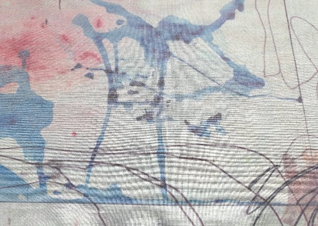
underlying themes of man and nature and its impact with the prevalence of line cutting through the natural forms. This medium gave me such an opportunity to play and not worry about mistakes, to just go with it.
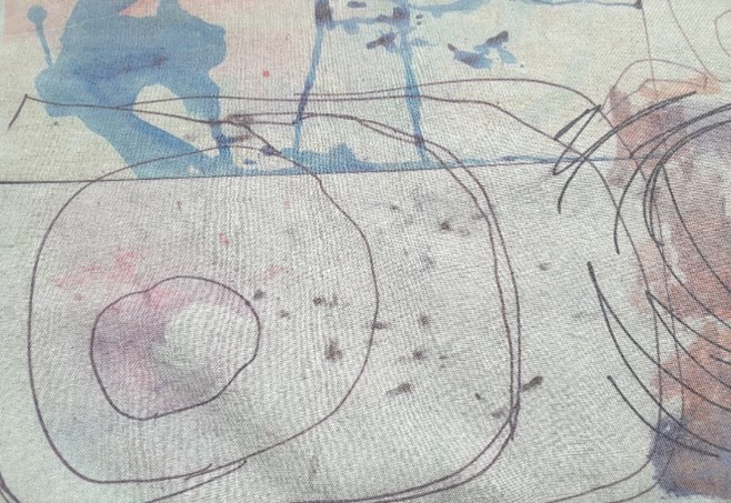
underlying themes of man and nature and its impact with the prevalence of line cutting through the natural forms. This medium gave me such an opportunity to play and not worry about mistakes, to just go with it.

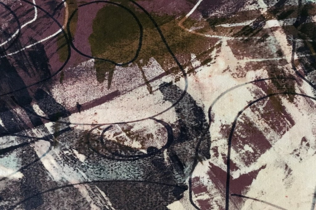
This trial-and-error approach lent itself to greater degrees of experimentation, of layering both complimentary and jarring imagery to create thought provoking groups of overlaid visual narratives with associated aesthetics. Given this process the layering of imagery produced a range of outcomes. When the group of imagery resonated with what I was trying to communicate it went well and it made sense to me. That said there were many occasions where the collected imagery of the A3 pieces of polycotton did not represent a cohesive whole and instead it was disjointed, messy and too difficult to identify and read. Too many overlaid images, colours, textural detailing, and line with shape led to confusing end results. Nevertheless, a lot of learning was gained along the way which led to more thought-out visual placements, arrangements of artwork-colour with texture and painted natural surface qualities and forms set against pen and ink natural outlines. How all the different media and processes including resources were brought together through layering was fundamental to the outcome, see images below using pen and line with texture/colour.

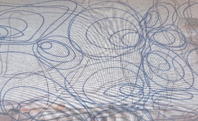
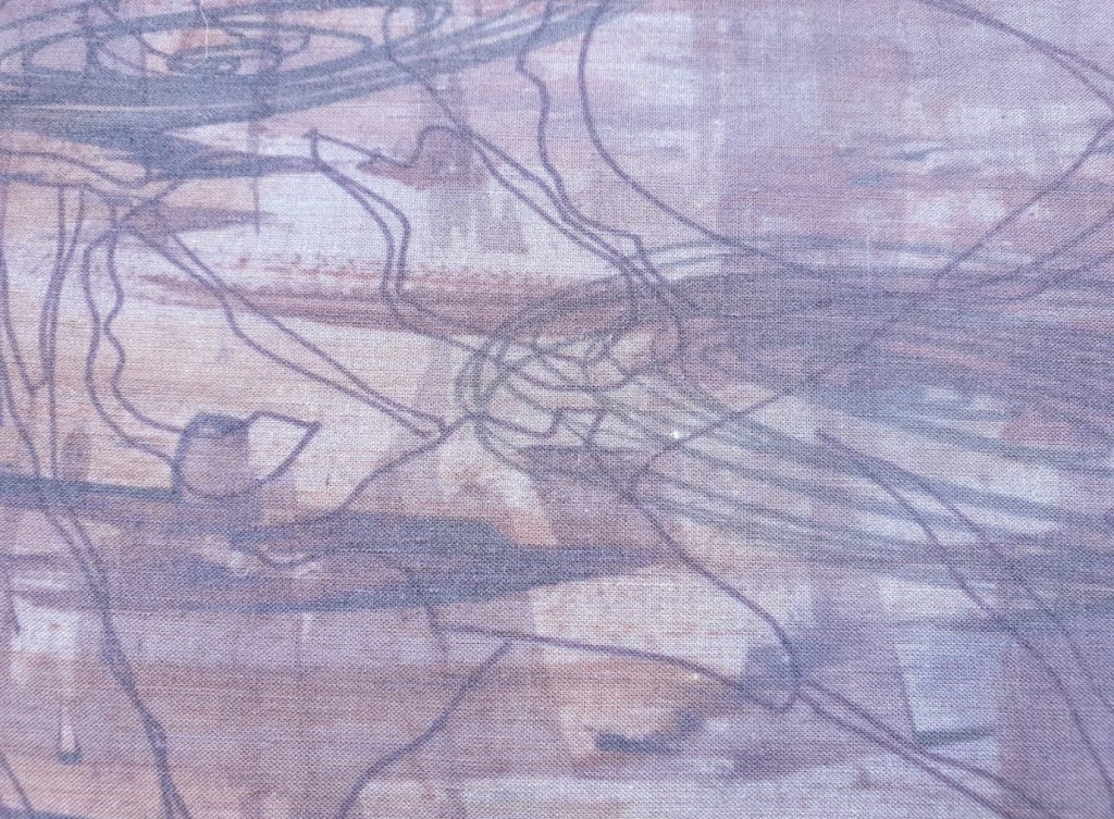
More dynamic mark making included the use of mono-printing using water-based printing inks to add a different dimension to the natural surface qualities in use. As I made progress, I discovered my natural colour, line, shape, textural mark making preferences which felt compatible with the range of options available to me. I have learned so much from experimentation through the printmaking processes and extended my understanding and use of additional printing techniques and methods. While many of the print-making processes using the heat transfer method did not work out as initially planned in going with the creative process I learned to value how the unintended outcomes often led onto more creative opportunities through layering and using the ideas generated to alter the subsequent making processes. I have been enabled through an unintended series of print processes to change directions, to see anew different possibilities, to react and respond in process to generate more meaningful, relevant, and material-led outcomes. In allowing the creative process to be increasingly messy and less controlled I have become more invested and in tune with my making and the meaning it has for me.
Introduction-Range of Artwork-Tapestry Weaving of Natural Surface Qualities
From my tutors’ feedback I paid increased attention to tapestry weaving as I had primarily focused upon printmaking in previous assignment work. I recognised the need to balance out my time more evenly across my creative practice to integrate more thoroughly tapestry weaving within the context in which I work. I initially focused upon creating a weaving that captured the beauty and fragility of aspects of natural surface qualities. This originated from both sketches-line drawings and collage work from a composite of outer shell coverings. The sampling processes included smaller and larger scale pieces.
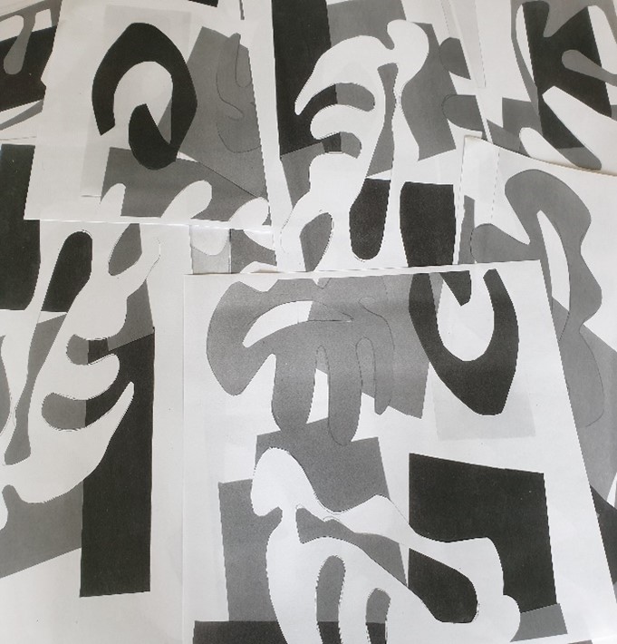

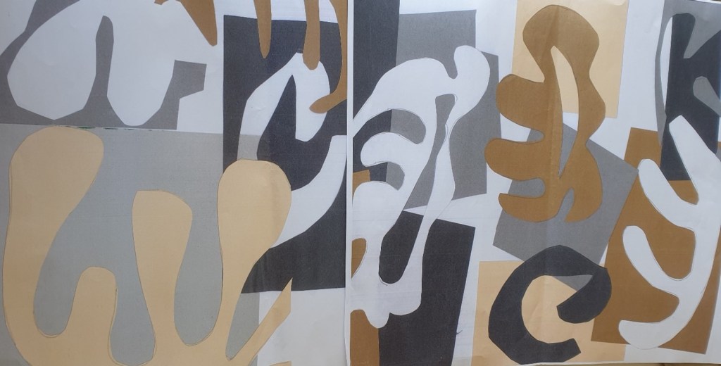
Introduction-Range of Sampling Processes-Tapestry Weaving of Natural Surface Qualities


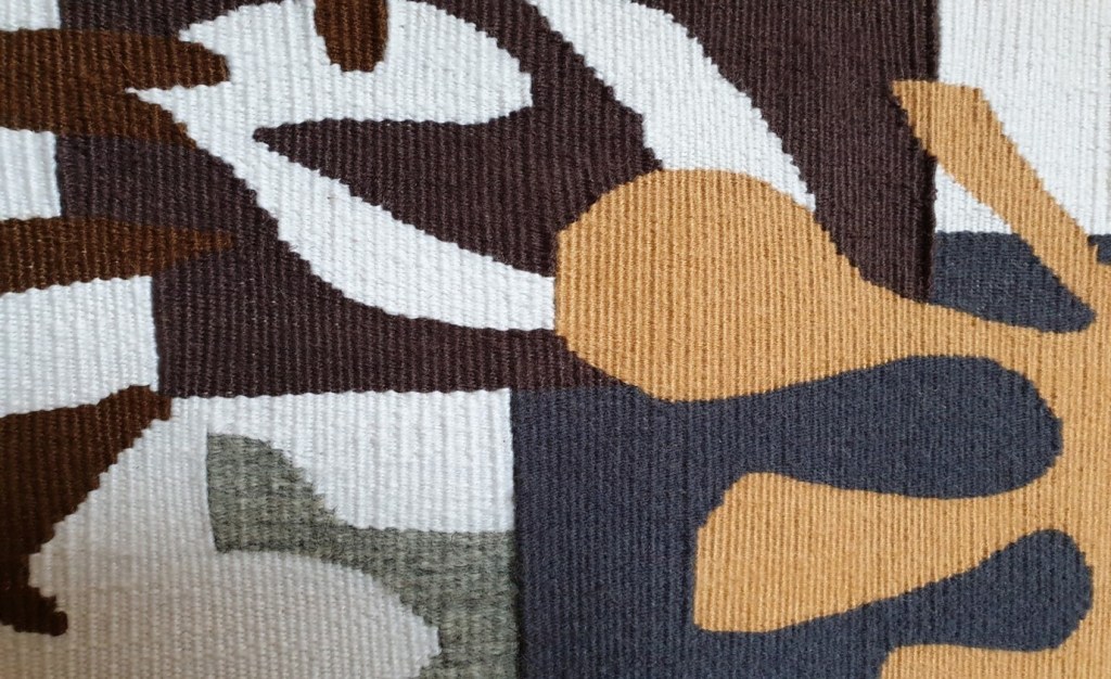
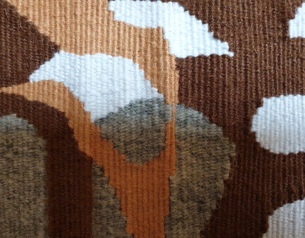
Tapestry Weaving Colour Sampling Processes for Beauty in Fragility: A Personal Response see below


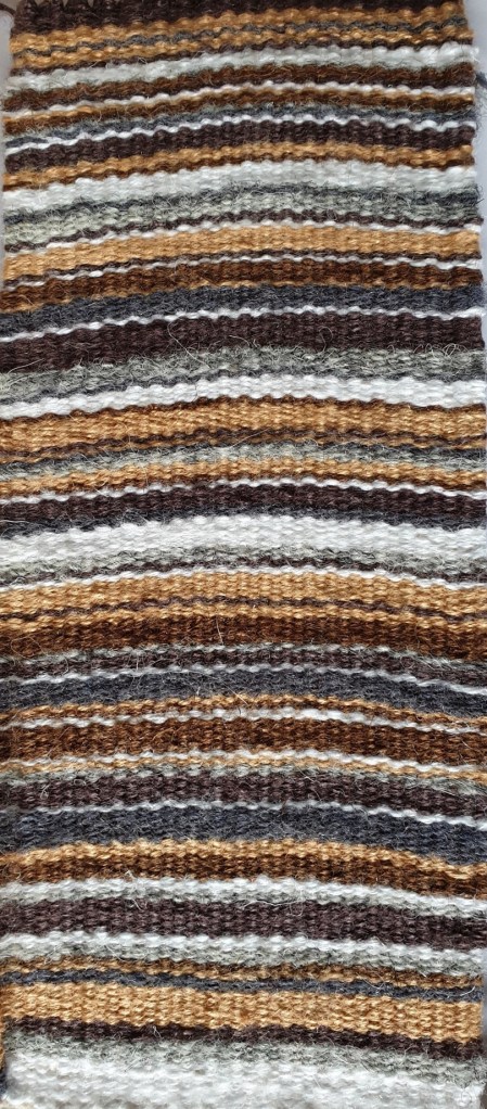


Inspiration for sampling colouration originated from one of the shells above. The shapes and line came from the curves of the outline shapes of other shells coupled with a range of shapes from the outer pattern coverings of shells. The beauty of shells with their fragility- capacity to be destroyed so readily resonated with my creative work. I wanted to explore the shapes abstracted from the individual shells to offer a colour study of natural shapes and line. That said I realised the need to further develop my tapestry weaving, to increasingly experiment with warp and weft, to move beyond what I already know about weaving.
Introduction-Range of Sampling Processes-Tapestry Weaving- Identity and Meaning
Tapestry Weaving Sketches- Initial smaller scale sampling with mixed cotton, silk and linen threads on glass

Through getting back into tapestry weaving, regularly weaving samples I became more aware and in touch with my past. From focusing initially on coastal life, I naturally progressed onto the sea. The sea pervades my identity, it is who I am as I have evolved from generations of fishermen and a long line of textile workers. The sea is also fundamental to us all as it is inextricably linked to our survival given global warming alongside marine and coastal pollution. This series of tapestry weavings illustrated a departure from what went before as I got something more of myself into the creative process. I focused upon water and the sea, of its movement with the ebb and flow of the tide given my own origins. I hand dyed a range of repurposed silk, cotton, linen threads, and wool to offer a greater tonal range of blues and greys to better reflect the many colours of the sea when in reflection with the sky. As I weaved, I could almost taste the salt and feel the water coursing around my body…it was as if I were back at the coast, the work emotionally resonated with me as it evoked so many feelings. As a result, I experimented more widely using the sea as the core theme.
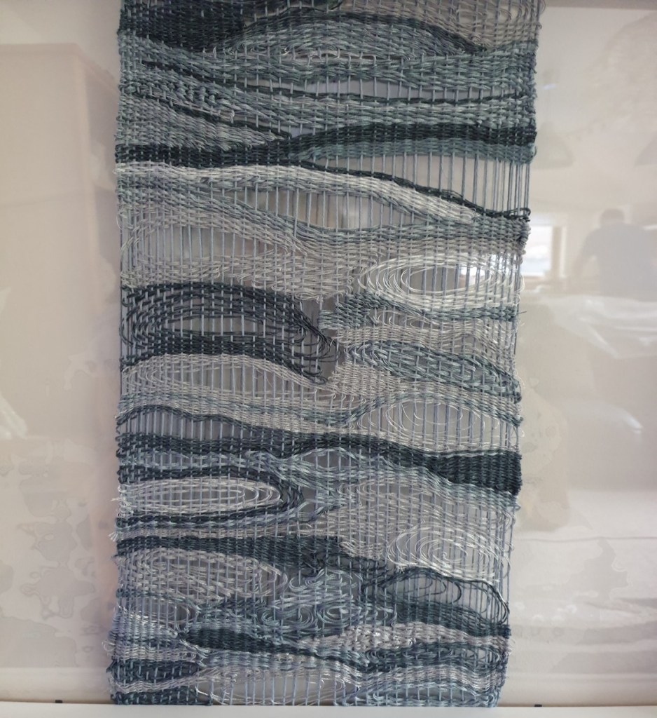
I experimented more with reused materials and what could be woven onto and around instead of using traditional wooden tapestry weaving frames as I wanted to focus upon the warp and weft in isolation of all else. I used glass tiles initially which proved difficult to warp up until I practised and got used to the glass. In sizing up the glass proved to be too heavy and fragile so I used perspex which was also quite fragile but I took care not to bend the perspex. I liked the juxaposition of plastic reuse with sea and water. In using different types of threads and materials to do different things throughout the weaving process I learned a lot about materials and advanced my creative practice as I started to think about other possibilities including large scale perspex tapestry weavings as installations coupled with expanding my material use to best encapsulate meaning through making, to say what I mean. This sampling process had sparked off a range of ideas concerning the amalgamation of context and identity within my creative practice.
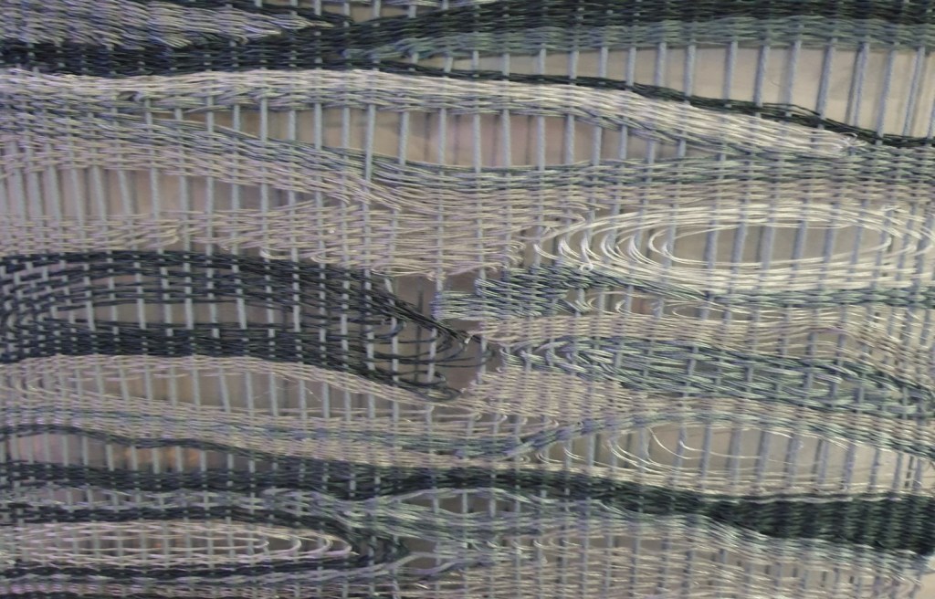
Tapestry Weaving Sketches- Initial smaller scale sampling with mixed cotton, silk and linen threads on frames
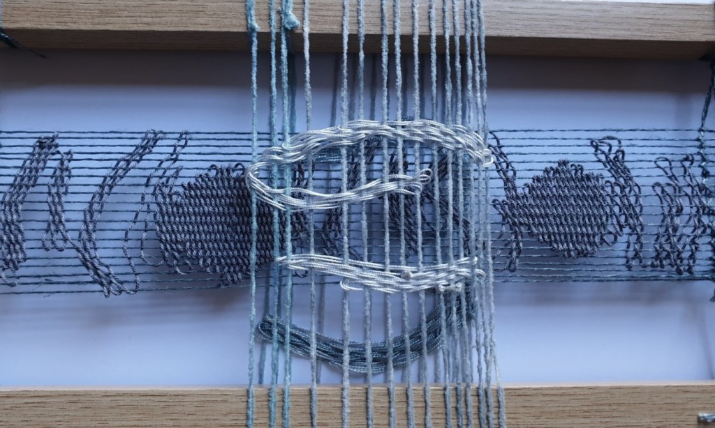
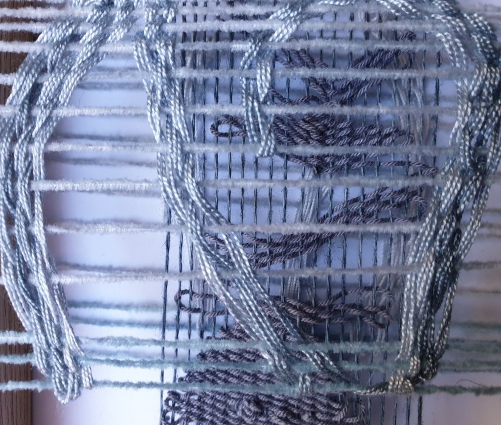
From a series of tapestry weaving sketches, I completed a larger scale sample. While using grey-blue cotton threads for the base layer I used lighter coloured blue cotton for the warp, so it also became part of the narrative. I tried to demonstrate the rhythms of the sea while capturing something of the emotion of water that is always on the move and under threat. I concealed faces within the weaving like African masks to show something of the sea and its displeasure of climate change and marine-coastal pollution. The face either way up illustrates planet Earth and the hurt of man’s inhumanity to nature through pollution and waste, through greed and instant gratification with fast fashion and sweat shops, overproduction and the lack of reuse, recycling, and repurposing.
Through being increasingly immersed in process, of being more open and receptive to doing things differently I found my learning and understanding of materials within a range of weaving processes was increased. From approaching tapestry weaving with an increasingly experimental frame of reference I was able to expand my material use to produce increasingly unique and impactful results. I was able to work with layering within tapestry weaving which was new with used and repurposed materials including metallic threads and plastic twine to good effect. In using increasingly unusual but relevant materials more dynamic outcomes were produced which expanded my creative thinking and future options.
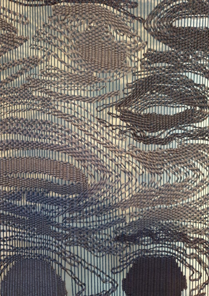

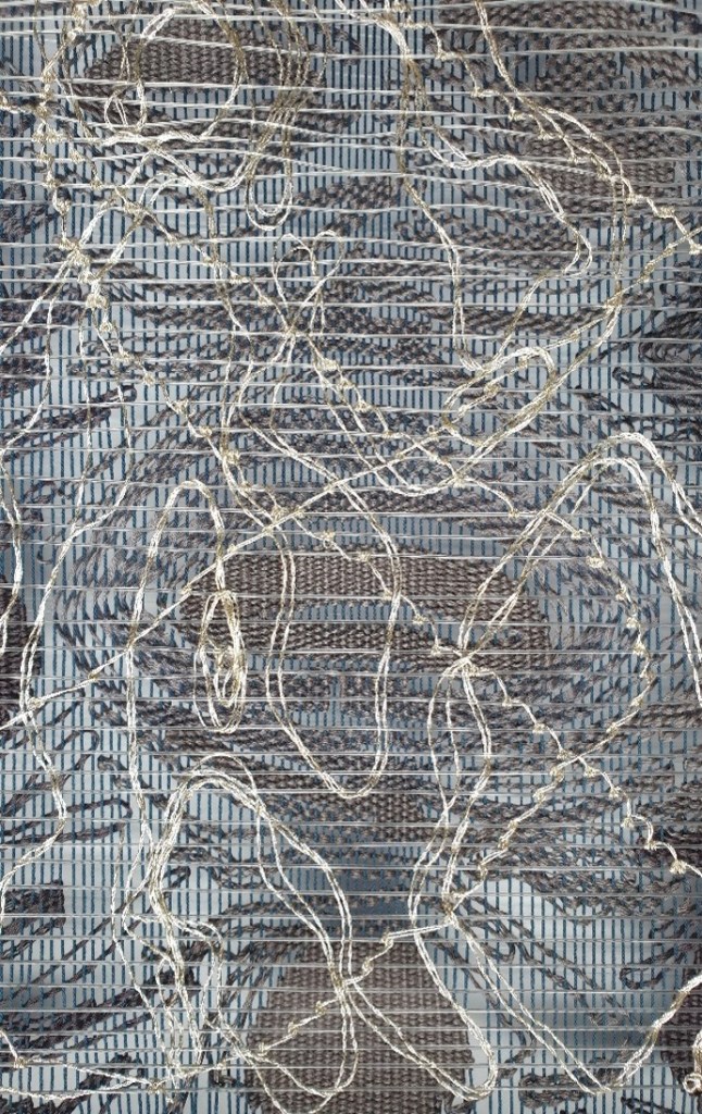
I wished to layer the tapestry weaving to experiment further to grasp something of the many nuances of the sea, to use metallic embroidery and sewing threads to catch something of the shimmering effects of water. I tried numerous plastic fishing twine for the warp across the frame to include water and plastic to emulate the current environmental threats. I had to slow down and think more while sampling the fishing twine as it proved to be quite difficult to maintain an appropriate tension while warping up the frame over the original work. Despite this I was able to reflect upon the merits of using different materials and how they would relate to one another. I used a thicker fishing twine to hold its shape and be less visible so the metallic threads could be the main focal point. I tried out lots of embroidery stitches including blanket and chain stitches until settling on half hitches as more reflective of the sea, sailors and fishermen who use such knots. As I was using such knots to compile the surface swirls and tensions of the water, I was immediately drawn to weave personal journeys made and experienced by the coastal waters of Scotland. I was surprised how emotional I felt as the past was triggered while I thought of these journeys. It reminded me of how I felt near water, of always having this sense of coming home, of rekindling a strong sense of belonging whenever I return to the coast.
