
Putting on an Art Show- The Promotion of Exhibitions
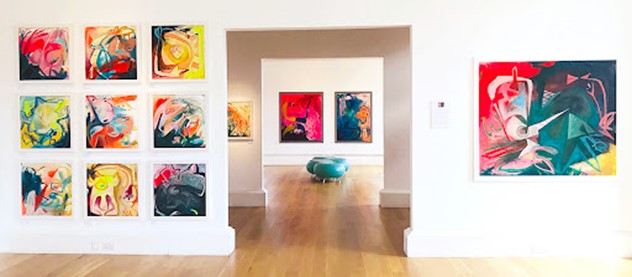
Alice Boyle has participated in many group art shows across Britain and held over ten very successful solo exhibitions. She has been effective in promoting herself and her art from 2008 onwards through several productive collaborations with gallery and agency representations. I have used this blog entry as an opportunity to review her flyers for exhibitions and how she has promoted such exhibitions to good effect. Alice Boyle has not only sold her original paintings, but she has also made copious print copies of the originals. She has been recognised as one of the ‘10 Scottish Artist’s you should know about’, in Culture Trip Magazine, she is making herself widely known, with her bold use of shapes, colour and texture. I am particularly drawn to her style of painting with acrylics including her development of layering and colour use.
Alice Boyle noted I am inspired by the power of dreams, mythology, and the collective unconscious. I use textures, vivid colours, shapes/symbols and layering techniques, aiming to stimulate the senses while exploring the eternal and intrinsic search for individual wholeness through the process of art and creativity. http://www.aliceboyle.co.uk/
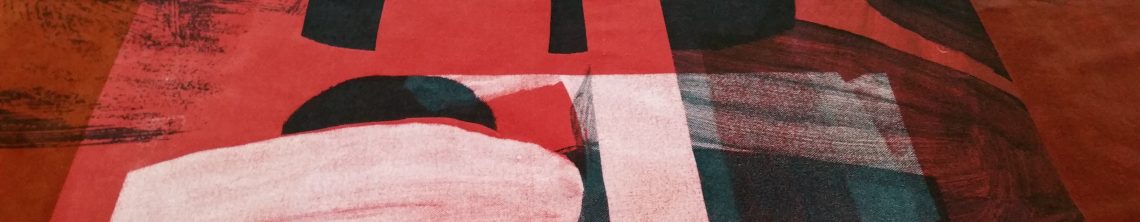
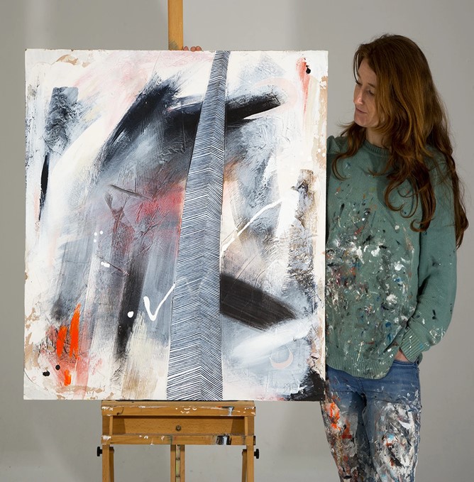
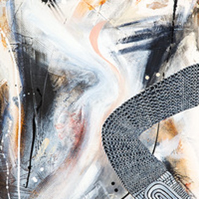
The evocative perfusion of shapes, fusion of textures and proliferation of colour embedded into the art of Alice Boyle is like a carnival for the senses. With each glance, a new emotion is unleashed. Through crafting layers upon layers of acrylic and plaster onto hardboard — with the pièce de résistance coming from fluidity of whichever utensil she chooses to imprint upon the painting — Boyle’s artworks point to true artistic prowess. Boyle, who conceptualised and co-founded the spellbinding Graffiti Project at Kelburn Castle, has a master’s from ECA and draws inspiration from the world around her as the artist noted ‘My artwork is about the journey of learning about the spirit of the world and ourselves, and accepting all the imperfections’. Many of the themes for her exhibitions have focused upon emotional resonance, of being less consumed with thinking and more with experiencing emotionally in the present tense. My favourite artwork by Alice Boyle stems from 2017 and the exhibition entitled “Think Less, Feel More” as there was more of a visceral quality to the series with the complementary colour palette, brisk brushwork and fluid mark making.
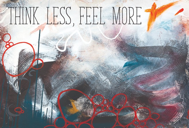

‘Think Less, Feel More’ was the second solo exhibition in Edinburgh by this abstract artist, Alice Boyle. Such paintings evoked a feeling of winter while at the same time developed tonal colour variations to soften the cold and break through to the promise of regeneration. The exhibition and title were inspired by the art critic Waldemar Januszczak’s review in the Sunday Times on the Abstract Expressionism exhibition in 2016 at the Royal Academy in London. Alice Boyle was deeply influenced by the phrase “There’s not enough emotion in our art anymore. We think too much and feel too little.” Alice Boyle then set about exploring the rudiments of emotion through acrylic paint, plaster and mark making on hard board which I seek to do through textiles, print and stitch. https://edinburghfestival.list.co.uk/event/835757-think-less-feel-more/
Alice Boyle acknowledged that “I attended the exhibition and got an overwhelming sense of freedom from excessive over thinking, which inspired me to loosen up my work. I stopped flitting from one idea to the next and decided on one colour palette and idea, which I explored vigorously yet spontaneously. My aim here is to illustrate a relationship between thinking and feeling in my paintings, by adding elements of intense patterns and repetitions to many of them, which represent, ‘Thinking’, in amongst a background which is more uninhibited.” I really appreciated her visual research concerning the separation of feelings from thoughts as it is such a fertile topic in therapy. I fully reflected upon the communication of emotion through mixed media and how this could inform my use of textiles to convey what I wanted to say emotionally. Alice Boyle emphasised that she wanted people “to feel emotion within her work and titles, which comes from her creative process”. https://artmag.co.uk/think-less-feel-alice-boyle-howe-street-arts/
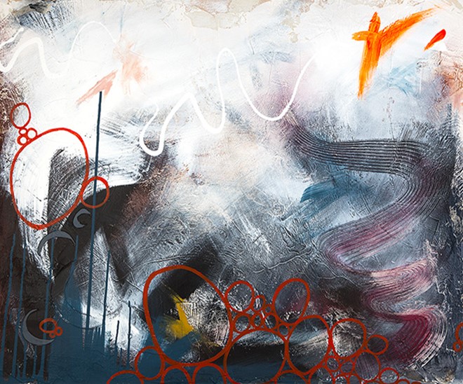
Alice Boyle works with layers of plaster because this process and the artworks themselves then have a sense of the primitive, giving the feel of pictograms or petroglyphs of ancient caves. Alice Boyle makes marks into the plaster with, various utensils, forcing her to be spontaneous as the final layer of plaster dries rapidly. It commands her from the start not to be too precious and to let her piece take on its own life in process. With my own intuitive and instinctive relating with the materials I could readily respect this artist and her creative process. Alice Boyle’s distinctively original work within this 2017 exhibition “Think Less, Feel More” was both wildly expressive yet also composed with an astutely detailed vision which frequently challenged and emotionally touched the viewer. As the title of the exhibition suggested, her work was there to be observed without too much thought and deep analysis rather the preference was just to go with the flow, to be in the present moment with one’s emotions.
Like Alice Boyle there needs to be clarity concerning the exhibition ideas and details that will make my exhibition stand out which is relevant on a personal level. There is a need to highlight the artwork and what sets me, my creative process and work apart. Press releases, artist statements, catalogues, posters, exhibition cards, invitations have all been evidenced with Alice Boyle which can prove to be extremely useful before, during, and after the exhibition. Use of these including the flyers to advertise the exhibition alongside the artwork before the exhibition remains a priority goal.


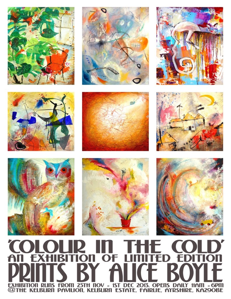

Alice Boyle (2012) The Inward Journey’, at The Bedfordbury Gallery, 3 Bedfordbury, Covent Garden, London, WC2N4BP. Exhibition run from the 15th – 21st May 2012. As part of the concept of the show, five people with very different interests named each of the artists paintings. Each painting was exhibited with the five titles displayed on the walls, but without reference to whose title was whose. The flyer included a preferred image to represent the artist, her artwork and the exhibition.
