
Jo Barker designs and weaves tapestries based upon a long-held interest in colour. I have been influenced by her work given my own interest in colour throughout my screen-printed textiles and increasingly within my tapestry weavings. Like Jo Barker I like to explore a range of marks, shapes and patterns with line through my drawing, painting and collage work. I can readily relate with this artists strong and bold use of colour. That said Jo Barker harnesses beautifully the power of colour with such vibrancy which is both sensual and emotive. Much thought and consideration has been contemplated throughout the mark making processes as her tapestries produce deeply personal responses to the marks made, of their immediacy, movement and sense of space.

From such ongoing admiration of her woven tapestries and related processes with mark making using colour I have been encouraged to explore the use of watercolour and acrylics more. My mark making continues to utilise handprint- making alongside drawing and painting but with an increased focus on merging and melding a range of mixed media and technique. More recently I have started to experiment more with gestural and expressive mark making for screen-printing processes. I would like to continue to develop my screen printing and tapestry weaving beyond where it is currently through a more defined relationship with natural surface qualities and my emotional response to them.
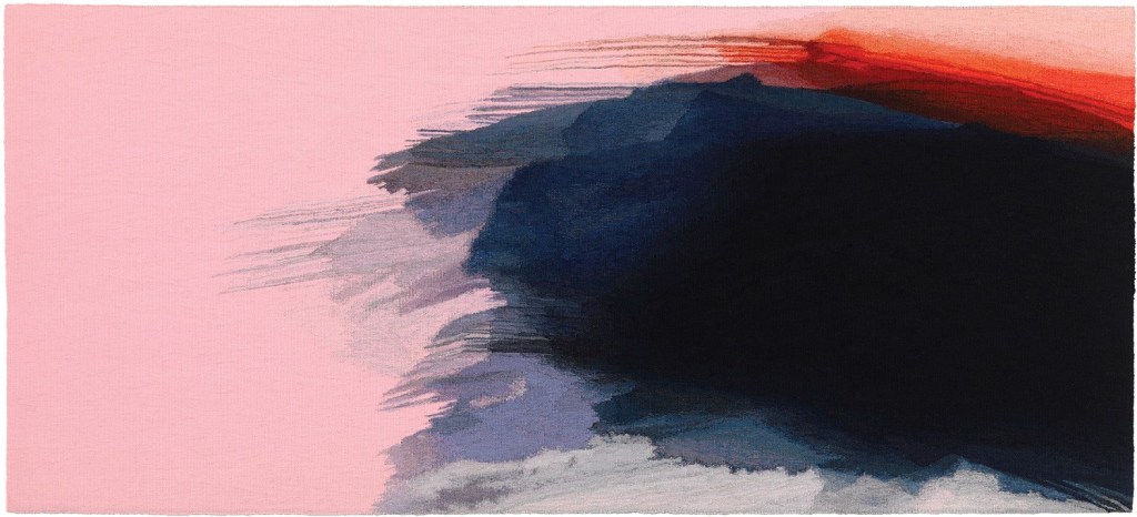
Tapestries Like Fleeting Glimpse and Fleeting Moment evoke such a presence given their level of skill, technique and expertise. The way the yarns and threads are woven using the tones and colours which seem to naturally melt into one another seamlessly produce free flowing palpable textiles and works of art.
Such an examination of colour with detail has helped to inspire me to continue to develop my work including my relationship with colour, marks, shape and line. To start to see the marks I make differently, to look more closely at what I produce, to harness a more reflective and critical eye to optimise what is there.
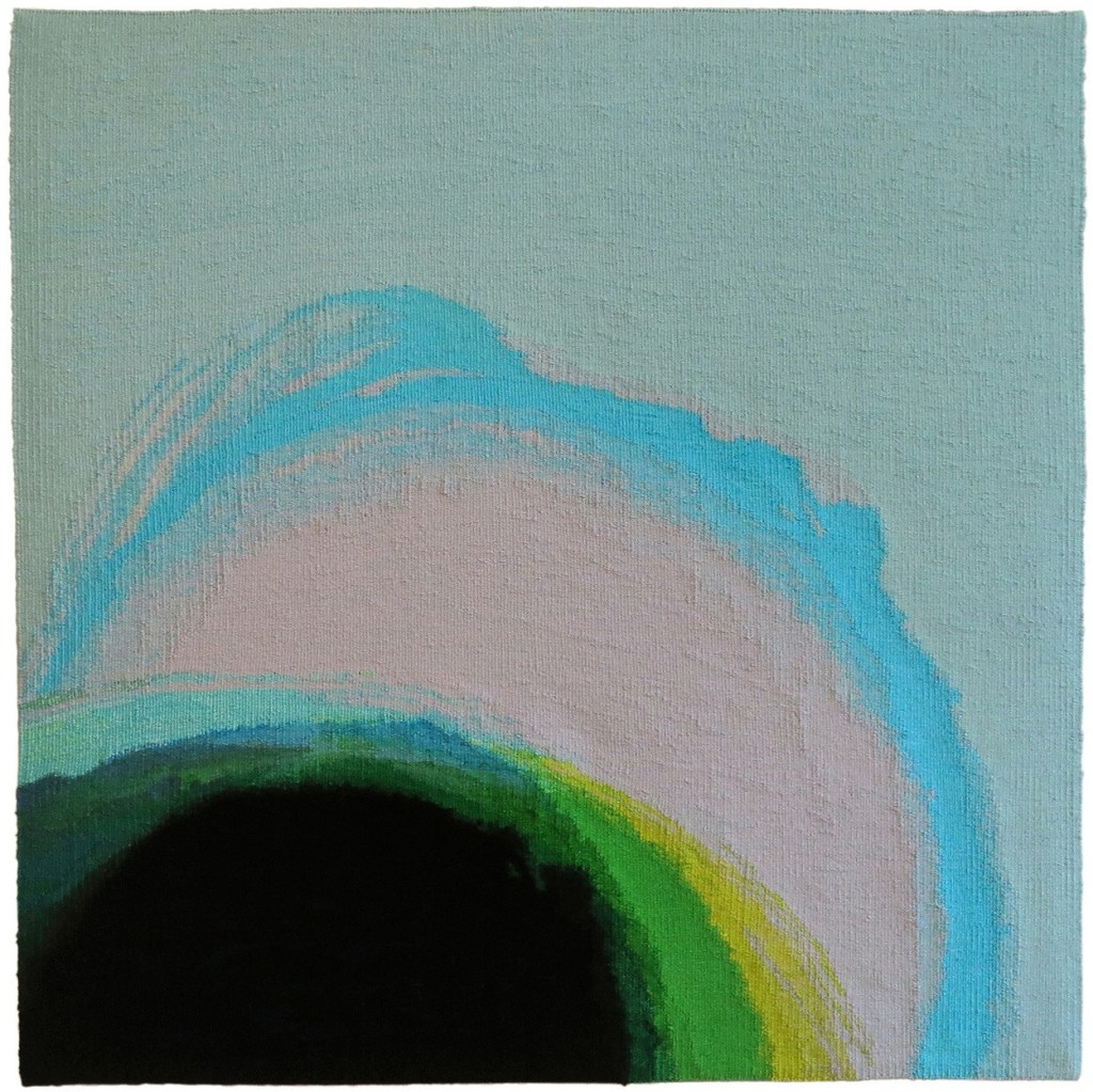
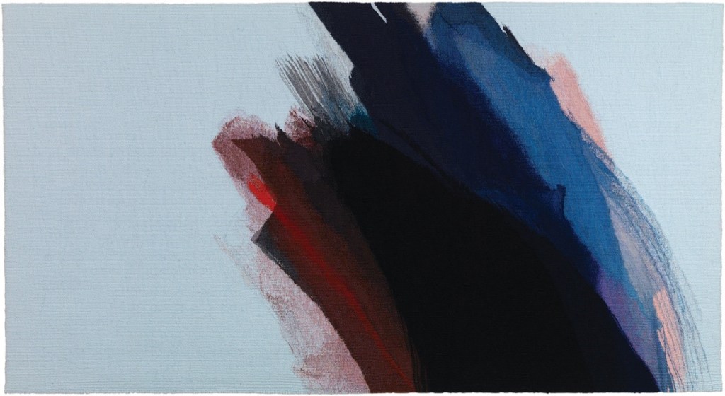
New Green exudes such depth of saturated colour with the green, blue, yellow hues contrasted with the strips or lines of magenta all of which seem intense and pulsating. The myriad of yarns and threads are used like paint to master depth and form with light and shade.

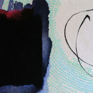
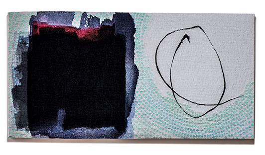
Ripple is part of the Inky Series which explores the quality of light, contrasting tones and layers of rich colour. The ripples of colour are beautifully woven to maximise this sense of rippling colour from dark to light. Each tapestry presents as an intricate examination of colour.