
Sampling Work to Investigate Options for Creating Very Large Scale Screen-Printed Visual Art with Enhanced Textural Qualities and Reduced Colour Palettes based upon more Worn, Muted, Natural Tones with a Bright Accent
Developing my Ideas-Narrowing and Broadening my Approach

From reflecting upon what went before including my work with paper, card and cardboard, prior tutor feedback, my own tutor feedback response, research processes and creative work with a range of materials including sheer muslin types and mixed cotton and linen blended textiles and composite materials I felt better placed to commence a new range of screen print sampling processes. In considering the fading and disappearance of multiple marine and coastal ecosystems I felt more prepared to make increasingly informed decisions in what I wanted to achieve given the scale of experimentation through layering to date. There was a significant scale of variables reflected upon through a range of prior processes which enabled the printing on multiple layers of material at the same time to create imprints. In doing so increased options were generated from one print to help explore a range of print effects on cloth, to extend a more in-depth relationship with material through print. The merits of exploiting the grain of the fabric was fully capitalised upon through screen printing processes by using the qualities of the material with the related collage and artwork to repeatedly produce textural elements of cloth to get closer to the material in use.
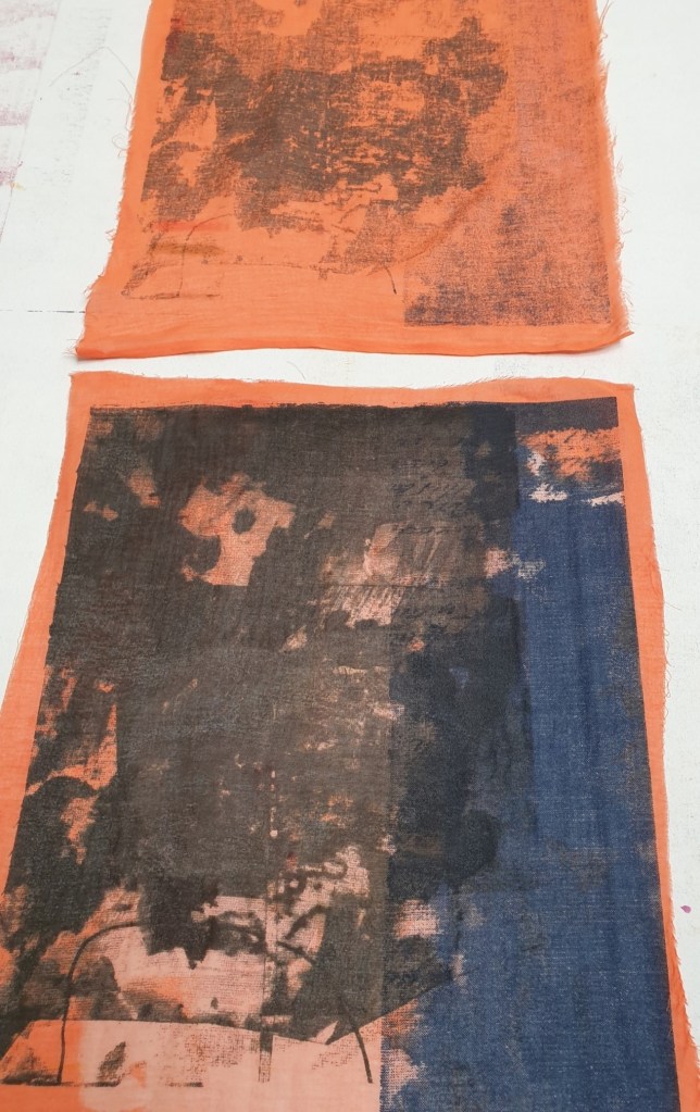
Six metres of hand dyed muslin from a range of sources including reclaimed, second hand and end of roll surplus was used alongside two metres of recycled mixed linen and cotton. The colour palette was led by prior and current experimentation through ink jet print sampling and the application of a range of colour mixes on different material types. Two metres of the linen and cotton fabric was dyed in brown tones while different weights of muslin were dyed in several of the preferred colours including orange, light grey and brown and all were dyed by hand in large receptacles. Some of the material was cut up into a series of 70 x 50 cm sizes to enable sampling across different colourways to offer a comprehensive sampling process to extend learning and understanding of the material and its relationship with print.
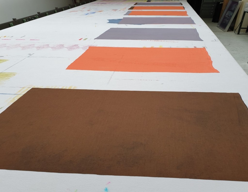
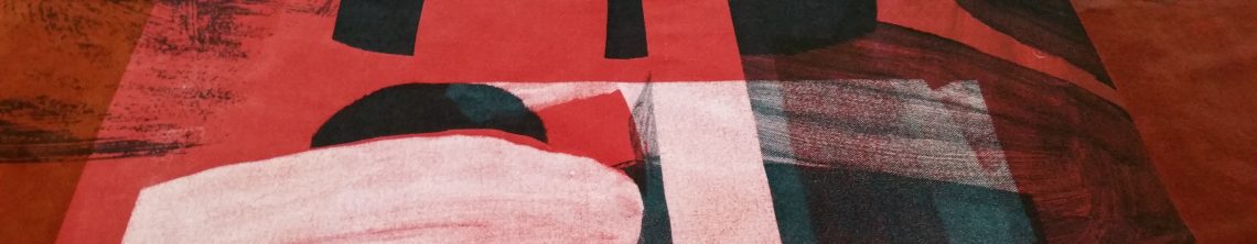
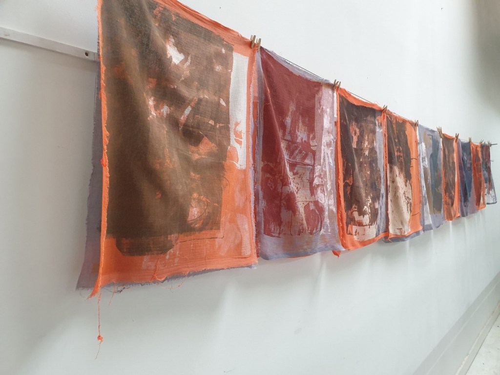
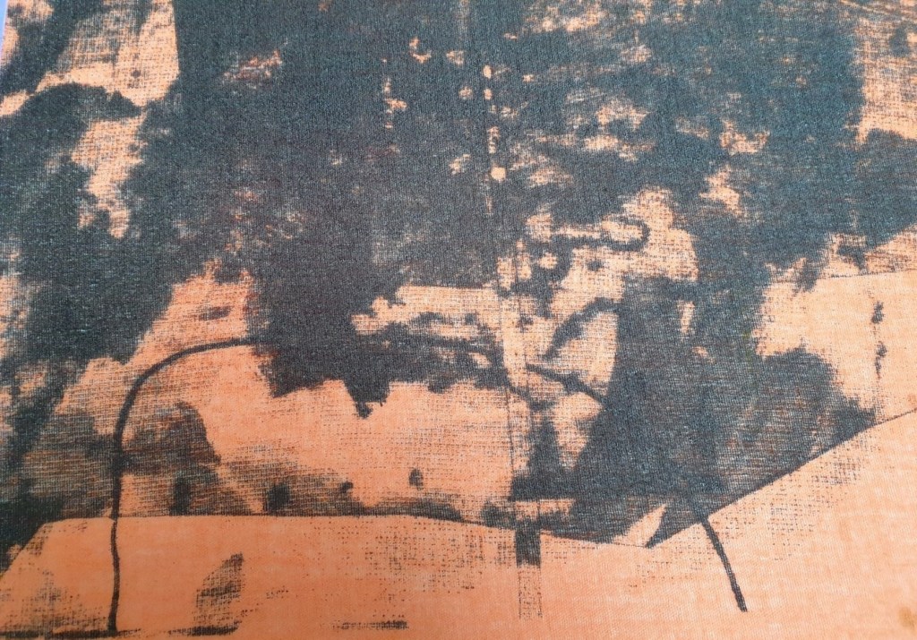
Each series comprised numerous 70 x 50cm samples with a mixed colour range. The colour palette for print was influenced with what worked well previously within the ink jet print sampling processes coupled with more recent collage and artwork. The overall rationale for colour selection for print was based upon the portrayal of the context and themes of fragility, fragmentation, disintegration, and disappearance. So worn and antiqued versions of colour were sought using a reduced colour palette with one accent colour. There was greater exploration of colour intensities as a specific aesthetic was preferred in accordance with environmental depletion and loss alongside the material used and its properties. The strength of the colour was increasingly explored through the mixing and use of a range of seaweed-based thickeners and print pastes to achieve more faded paired back results excluding the accent colours. The colours most in use were dull green (black, yellow, and black), dull yellow (yellow, brown, and violet) and brown-red-orange (with navy). Darker blue-grey, light grey and blue all included black.
Adapted source material and new artwork was used based upon environmental fragility and sustainability using natural surface qualities. Such qualities afforded continuing research and investigation into the key themes of marine and coastal depletion and disappearance. The ideas of fragility, brittleness, fragmentation, disintegration, and disappearance were investigated in line with the context in which I work. There was a greater emphasis upon textural elements of natural surface qualities.


During the screen-printing processes different techniques were trialled to produce variable outcomes based upon specific themes. I felt that it was an increasingly considered and involved process as I weighed up how each print reacted with the different weights of muslin and linen-cotton blended materials. I was fully engaged within the screen-printing process, of evaluating the materials response after each print was made in accordance with the number of pulls and pressure exerted, and the outcomes were compared with the overall effects. I worked on developing more of a personal relationship with the application of colour and how such colours were seen against the original dyed backgrounds, different textural mark making, discharge, drawn stencilling and hand cut masking, of how the colours, shapes and line interacted…so many inter- relationships were explored.

On reviewing my sample range, I felt that I had acheived the relationship with materials that I had hoped for, to create the effects of fragility, disintegration, and disappearance. The positive outcomes which were evidenced evolved from my respectful handling of the sheer materials being used and printed onto. This analogy of respectful handling of the sheer materials especially the fine muslin directly referred to and with the respectful handling of the environment. Through my creative practice and my work with a range of materials I felt closer to the environment as it informed and defined what I did. Every decision made reflected favourably upon environmental sustainability and minimising waste, of only using what I need, of selecting reclaimed materials, of recycling, repurposing, and reusing as part of my creative process. The imagery used always stemmed from nature itself especially natural surface qualities of coastal and marine life. That said the beauty of fragility continued to act as an inspiration for my making, to further cement the fragility of the environment and the fragility of my imagery, to convey the vulnerability of such natural forms, of aspects of natural surface qualities and the creative process.
I have always had an affinity to the coast and the sea, I have evolved from a long line of fisherman in the East Neuk of Fife going back hundreds of years and such themes with the sea have continued on through the Royal Navy and merchant navy to the present day. The coast and the sea have been deeply embedded within my identity and who I am. I stay where I do as my family moved to secure fishing rights many years ago when the fish stocks were still plentiful and what was taken was what was required to maintain what was there. I have been brought up to respect the sea and what it needs… to only use what is required to maintain a natural balance and order within the environment. From all these memories on boats from a young child onwards, appreciating the sea, coast and nature I tried to imbue such depth of feeling and relating into my creative work through the materials used and my relationship with the materials. I wished to communicate and convey the beauty with the fragility of nature from such environments, to be able to look to see the complexity of such life forms like shells and to increasingly recognise what is being broken and destroyed. Without increased intervention disappearance of multiple marine and coastal species seems inevitable. From walks along many beaches and coastal paths over the years I can see first-hand the disrespect shown to nature with the unnecessary waste strewn end to end coupled with the floating debris out to sea. In focusing in on the relationship with materials, of showing respect something beautiful can come from changing our relationship with materials, of caring more and discarding less. For me, the beauty came from such fragility in both highlighting the fragility and working in such ways to fully acknowledge fragility.


That the continuing colour applications on the sheer muslin produced enough light and shade, variation, substance, overlapping and layering to create complex, impactful, and unique printed textiles. which has been set against the fragility and fragmentation of the fine materials used. The aim going forward was to continue to capture such fragility within the imagery and the material used but to create larger scale statement pieces, to be bigger, but more subtle in the application of the screen printing processes including the colour palette. In considering the knowledge gleaned from working on sheer muslin including the preferred colourways and techniques I felt adequately equipped to increase the scale of the imagery and technique to a size beyond what I had worked on before.

Throughout this sampling process I focused upon using what is so often considered waste and from this I ensured that I did not generate any more waste…I used only what was required. I enjoyed experimenting to create different textural configurations, to use parts of the exposed imagery on the screens to generate more interesting interplays with every print. I focused upon the appearance and disappearance of print in keeping with the underlying theme of this series of sampling. I created different outline effects with layering, colour, texture, resist and stencilling on the sheer muslin and on the screens.

The sheer muslin exposed exemplified the bleaching effects of the coral reefs set against the printed areas, of fragmentation, disintegration, and disappearance of marine ecosystems. The fragility of the sheer muslin to look at and to touch highlighted this sense of brittleness with its fraying, distortion, and broken parts. I felt that through this process I was representing myself, a significant part of my own identity, of my formative years, the development of my beliefs, my relationship with nature especially my experiencing with the sea and the coast through my family. It felt like a process of remembrance, of times gone by, of family no longer here, of those loved and lost.
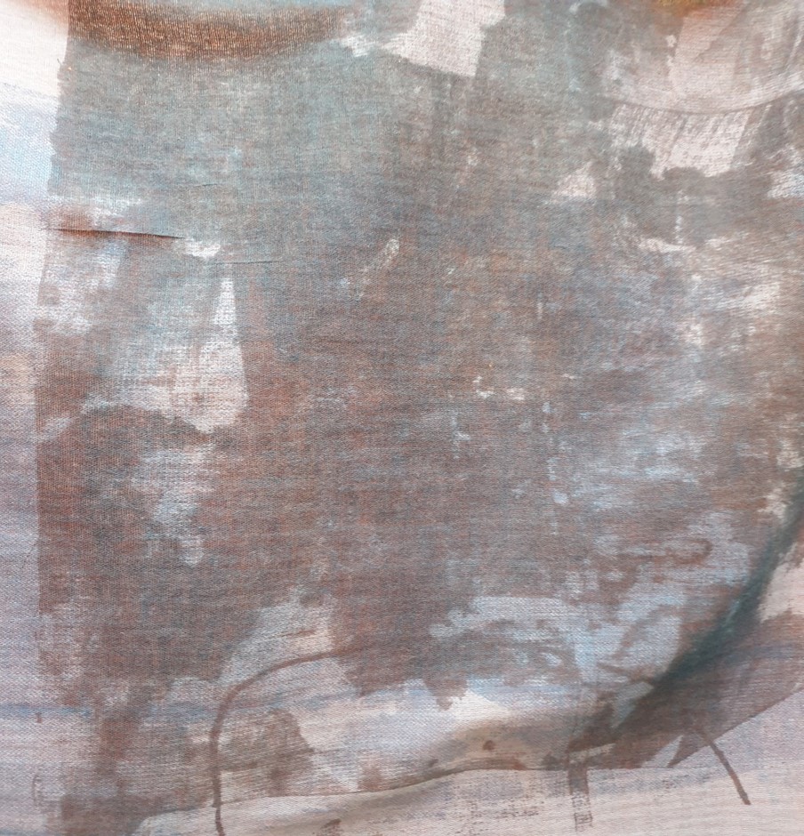
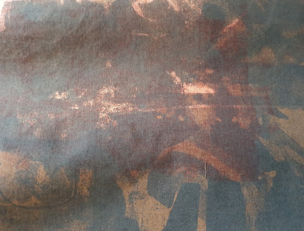
From the sampling processes preferred colourways were realised including use of dull yellow, grey-blue and a selection of greys and blues on grey-blue dyed sheer muslin. This colour palette seem to situate naturally within the context of the sea and the coast and it felt right as it evoked prior experiencing of the sea and the coast with my family, of being a child on the sand and in the water…the colours resonated with me at a more visceral level, of feeling the same sensations as I worked with such coloured inks on the cloth. As such feelings were reverberated in process it felt right to be led by this going forward so this colour palette was chosen for my final extremely large material pieces.
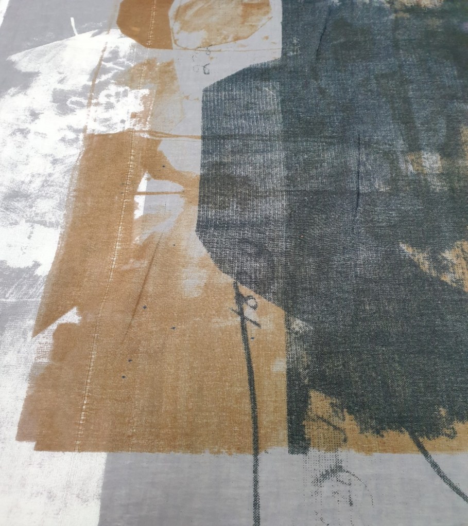
In layering up of the materials before the printing process a range of imprints were created which were either left as completed samples or printed onto once separated from the top layers. Through experimentation two layers of dyed muslin or one layer of dyed muslin and one layer of dyed linen and cotton material produced the most ethereal-based effects on the underneath layer. Ghost-like imagery often resulted from such layering especially when only two layers of loosely constructed muslin was used with 6-8 pulls to enable the printing ink to penetrate both layers to varying degrees dependent upon the pressure applied. Increasingly through the process the imprints were often favoured over many of the top layers. The way that the muslin held onto the colour produced a fragmented layering of print. Further prints of an accent colour produced beautiful highlights which accentuated a fading visual and exemplified the context, of fragility, disintegration, and disappearance.
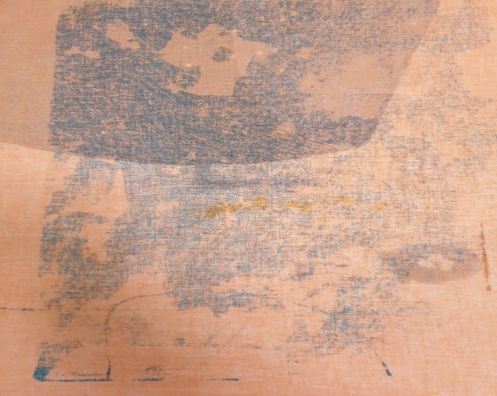
I was once again drawn into the melding and fading of colours alongside the variability of textural marks used… intuitively working with the fabric and its properties. I was conscious of being led by how the materials responded to the printing inks in use and how the overlaid colours reacted with each other, of the interplay of material and myself which led onto realising preferred colour schemes. The light grey, dull yellow and blue worked particularly well on the light grey coloured muslin cotton. This sampling process involving imprints as much as prints enabled me to select a few preferred colour schemes for my larger scale work given how the colour and mark making had interacted with each other. Ultimately, I selected from the samples which emotionally resonated with me most.
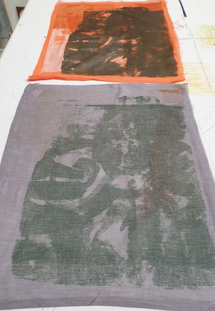
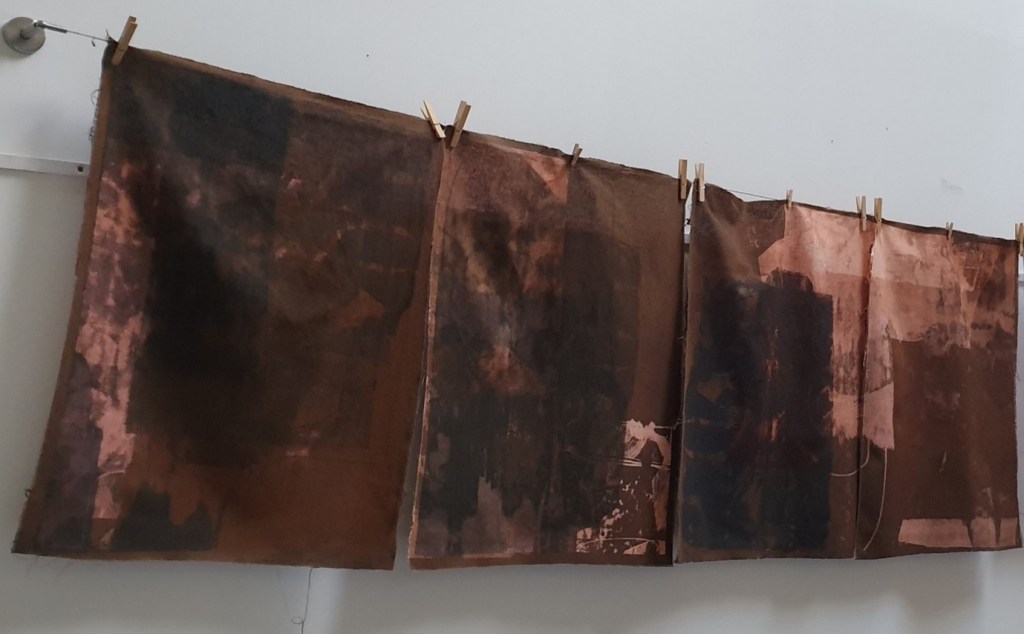

One of the associated screen-printing processes with sheer muslin involved the use of a much thicker, denser, and closer weave cloth made from 50% cotton and 50% linen. This process was combined with sheer muslin to explore both print and imprint on other weighted materials. The material was dyed brown as the base colour to symbolise decay and age, to experiment with and investigate death as the core theme under investigation. Despite the heavier weighted material in use with the repeated removal and addition of printing ink the material looked worn, decayed and worst for wear. I liked this sense of transformation from start to finish as the cotton-linen material became something different and unexpected. The bleaching effects with the print effects worked well together to communicate this process of death, destruction, and disappearance as applicable to environmental change. The idea of fragility was seen from a different perspective through the use and reuse of cloth to disrupt and destroy many of the natural qualities of the cloth to create something akin to environmental desolation.
Ultimately, I was pleased with the eventual outcomes given the process involved and the scale of work which was undertaken. Through working and reworking the material…the cloth changed in line with the process used. Further investigation is possible to extend this work further to strip back more to change and transform, to layer to increasingly highlight concepts of death, destruction, and disappearance on a larger scale.

1 Comment