
Project Work Investigating and Creating Larger Scale, Textural Qualities with Colour Palettes based upon more Worn, Muted, Natural Tones with a Bright Accent
Developing my Ideas-Narrowing and Broadening my Approach
Printmaking and Tapestry Weaving
Assignment 4 Learning Log in conjunction with my online blog www.weaveprint.com
Gillian Morris Student No 511388
Environmental Fragility- Development of Ideas, Processes, and Issues Experimentation through Sampling in line with my Personal Proposal
Introduction
On reviewing the work undertaken for assignment three alongside my tutors’ feedback I compiled my response LINK 1-TUTOR FEEDBACK RESPONSE I was able to reflect upon my continuing narrower direction centred upon my relationship with materials based upon environmentally sound creative practice and processes using print and weave. To reuse materials which promote environmental sustainability and reduced waste to continue to encapsulate related themes of fragility, disintegration, fracturing, through material use and printing ink. The relationship between material, print, imprint, and resist was thoroughly investigated to explore the related themes. As stated in my blog entries and my response to such feedback I increasingly recognised where my strengths lay and what was in keeping with who I am and the way I work. I like to develop relationships with the materials I work with, to be in relationship at a deeper level through an extended investigative process to be more in tune with heightened degrees of personal engagement and reciprocation… as I relate and respond with the material, I am working with I am led by how the material relates and responds back. That said larger scale screen printing has evoked such an emotional connection given the mental and physical engagement which was required with the heighted knowledge and understanding of the material I increased and varied the scale of my work once more through the screen-printing sampling processes with allowed access back into the studio.
Research
Through tutor recommendations and further research this fuelled a creative need to replicate this depth of relating with different materials using screen printing. I was struck by the Works on Paper by Maija Luutonen. New Wave Pt.1-3 (2010) Work on Paper created and restructured the paper and the space it inhabited which interested me alongside her use of rolls of paper hanging off walls to examine scale and space. In addition to this I was inspired by Val Britton and her work with paper, of her use of mark making, recycling and spatial layering to create three dimensional installations and new relationships with paper. VAL BRITTON . Of resonance with Ways to Navigate through what we’ve Built and what we’ve Destroyed II (2006-2008) whereby Val Britton used recycled materials including print, collage and cut-out paper to create a statement piece to examine our relationship with the environment. From these artists and others, I gravitated to research further and wider to include artists who work with a range of related environmentally supportive materials including cardboard. Mixed media artists-sculptors Hyacinta Hovestadt, Sabrina Fadail and Miika Nyyssonen Hovestadt, Fadail, Nyyssonen Blog all used cardboard to create beautiful forms from fragile materials inspired by nature. Tobias Putrih, contemporary artist-sculptor used everyday materials such as cardboard, paper, and Styrofoam substances to explore fractured forms to produce imperfections through a series of accumulated mistakes like the Macula Series (2007 onwards) which acted as a life lesson to me. Tobias Putrih Blog. Marie José Gustave, visual artist, with her use of layers of recycled cardboard to build Hypnotic Walls increasingly highlighted the beauty and versatility of cardboard although my creative process is dependent upon hand-made for deeper relational engagement with the materials in use. Marie José Gustave Blog
Experimental Sampling Processes using Paper, Card, Cardboard and Composite Materials like MDF and OSB and Sheer Muslin with Cotton-Linen Blended Material
After researching other artists who commonly use paper including newsprint, card, cardboard, and composite materials I was inspired to allow my initial exploration of paper, card, cardboard and MDF with print, imprint, pressure, resist, and weave to flow. Although this had not been initially envisaged as the route I would take, such a creative process proved to be incredibly useful as it opened-up a new relationship with recycled materials with endless possibilities for now and the future. On veering off track, it was liberating to play with different materials through screen printing processes. The materials themselves was led by what could be sourced sustainably, of using recycled newsprint and composites, repurposed paper and card waste products alongside naturally produced papers which support the environment. Initially I experimented using the recycled newsprint to examine how the material responded to printing ink and imagery used from artwork which stemmed from coastal natural surface qualities.


I liked how the printing ink reacted with the more sheer newsprint, of altering its construction and splintering the surface quality of the paper. Often the imagery with the paper was distorted as it disintegrated through newly formed rivulets of natural crumpling, pleating, folding, bending, and fragmenting with artificial and natural drying processes. I used printing ink which had been left in the studio from other art projects as I wished to completely sample from recycled, repurposed materials including what was deemed waste. From such initial sampling processes using different types of newsprint I extended such relating to creating a series of sampling entitled Fractured (2020) on twenty-four sheets of A2 sized recycled newsprint using shredded waste products as resist. Newsprint Sampling Blog From using such a mix of materials and techniques so many varying outcomes could be realised. I enjoyed how the interaction of the screen-printing processes using a very small squeegee as if a paint brush yielded interesting visual mark making qualities as every nuance of the marks made were held and retained by the newsprint then distorted as the inks dried into the newsprint.

From there I started to use different paper types to disrupt, to explore the use of different rolls of recycled white craft paper and rolls of waste brown stationary paper which was originally made for use in envelope manufacture. I wanted to develop two-dimensional usage into three-dimensional sculptural forms, to investigate the concepts of environmental transformation and change through screen printing. Using Different Paper Types to Disrupt

This series entitled Disrupt (2020) used watercolour mark making from natural surface qualities to create dynamic areas of print using pink, pale green, and light grey printing inks. While the colours used were preferred selections from intended waste the focus was on increased understanding of the materials being printed onto. Once the rolls were dried, they were distorted manually to create different forms and relationships with the spaces they inhabited within the immediate environment.
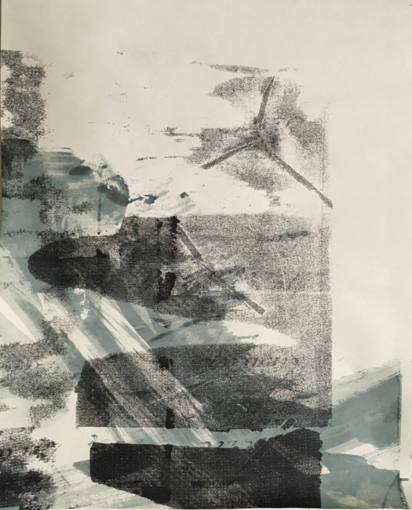
Natural Sugar Paper from Waste Remnants was used to create a series of four A2-sized prints using imprints and resist. Sugar Paper Blog The roughness of the surface quality of sugar paper created impactful areas of mark making through print, imprint, and resist. The use of resist exploited the grain and textural qualities of the paper and the sugarcane by-product waste. Apart from the addition of deep pink a simplified colour palette of black and pale green printing inks was preferred given the transparency of the pale green contrasted with the textured paper surface and the solidity of the black. Some of the mark making was created by not cleaning the screens and allowing additional imprints to be made with the use of shredded wastepaper and recycled haberdashery items like threads, fringing and ribbon which were left on and removed from the screens between prints. The rough and unfinished surface texture of the sugar paper meant that it proved to be relatively easy to print onto as it absorbed the print well without any distortion. Its overall resilence and strength evidenced the beauty and uniqueness of waste, of the benefits of using recycled and repurposed materials that have already lived a life to use that experiencing in relationship in print. Back to finer materials I used different sheer paper types to explore the idea of fragility of which rice paper created the most beautiful relating with the prinking ink. From waste reminants the rice paper used produced a series of nine prints and imprints. Rice Paper Blog

Through sampling processes, I preferred unsized rice paper which was more of a raw product with heightened degrees of absorbency with a soft and textured surface quality. The small squeegee worked well as it could be more readily manipulated to suit the rice paper. Although there were difficulties with the rice paper ripping and pulling apart, this exemplified the underlying theme of fracturing and fitted with what I wished to communicate, of environmental fragility and brittleness and its fight for survival.
A series of sampling processes included Medium Density Fibreboard (MDF) and Oriental Strand Board (OSB) however the MDF proved to be considerably more successful than OSB. Composite Materials Blog

MDF is extremely versatile and can be machined and finished to a high standard. From experimenting with MDF I was pleasantly surprised just how well the material accepted the printing ink. Single pulls using a small squeegee continued to be utilised as proven to be the most effective techniques from exploring different approaches. The printing ink suited the surface quality as it accepted the ink readily and the colours used dried darker especially the deep pink and blue. This Waste Collective (2020) further evidenced the beauty of waste.
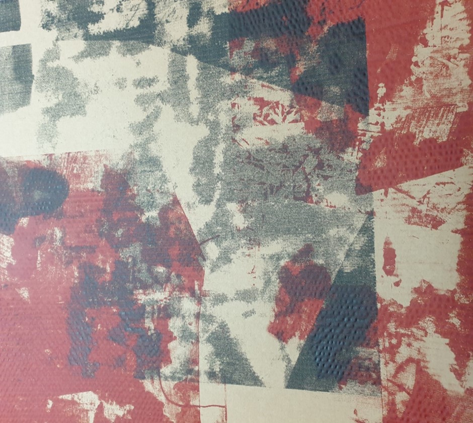
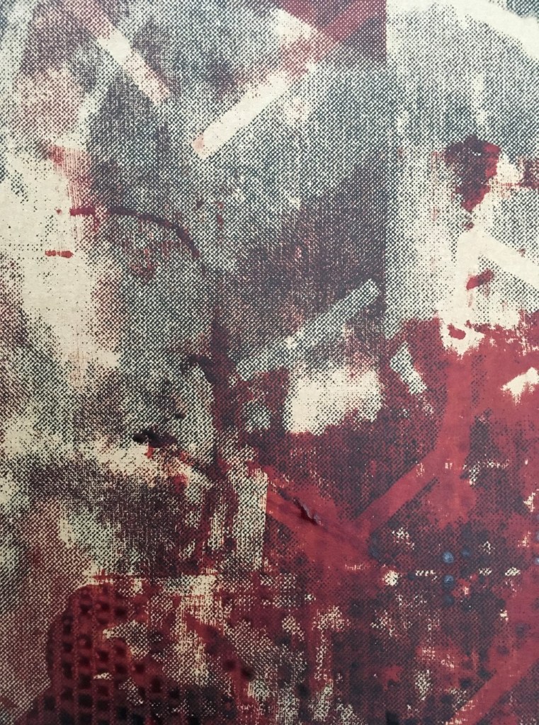
From discovering different types of cardboard with white and natural surface finishes many and varied sampling processes were realised using screen printing processes. Cardboard Types Blog In using primarily A1 sized cardboard different waste materials continued to be used as complementary and contrasting forms of resist including different forms and weights of shredded paper and card of which some of the waste had already been printed on to create additional effects in print. A mixed range of imagery which evolved from artwork focused upon the natural surface qualities especially textures was used alongside the effects of imprint, print and resist. Black and grey coloured printing inks with brown-red-orange variations worked well with the qualities of the material to promote the use of recycling.
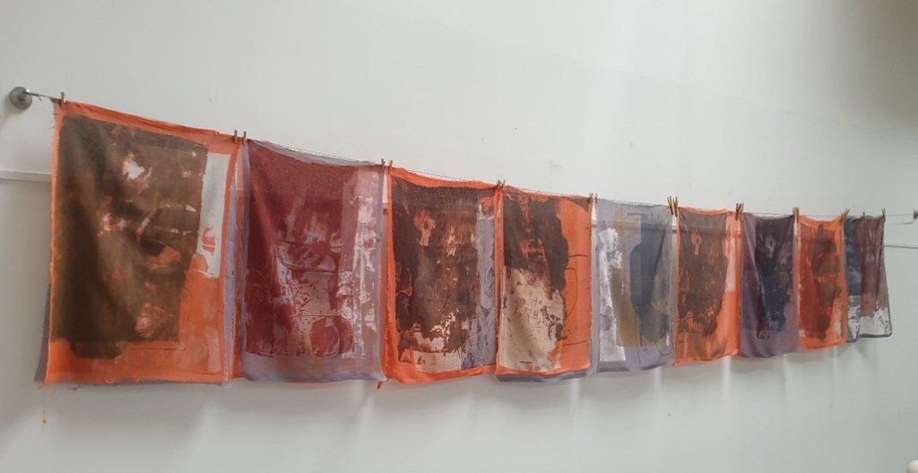
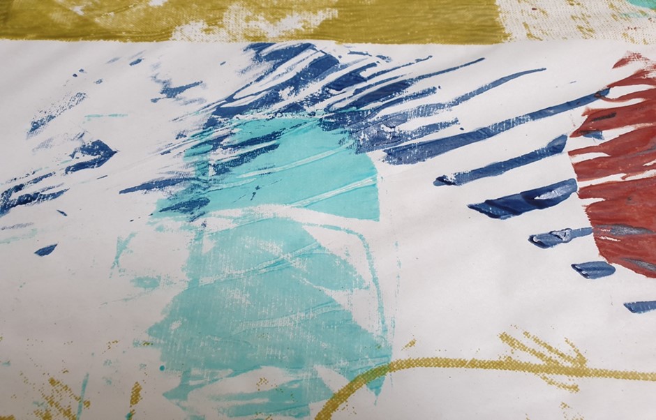
From reflecting upon what went before including my work with paper, card and cardboard, prior tutor feedback, my own tutor feedback response, research processes and creative work with a range of materials including composite materials I felt better placed to complete a range of screen print sampling processes with repurposed sheer muslin types and mixed cotton and linen blended textiles. Screen Printing Processes Blog
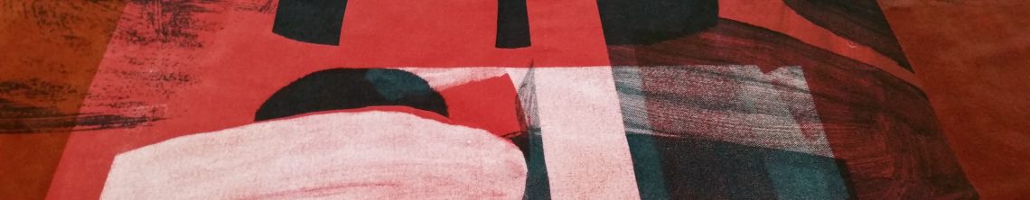
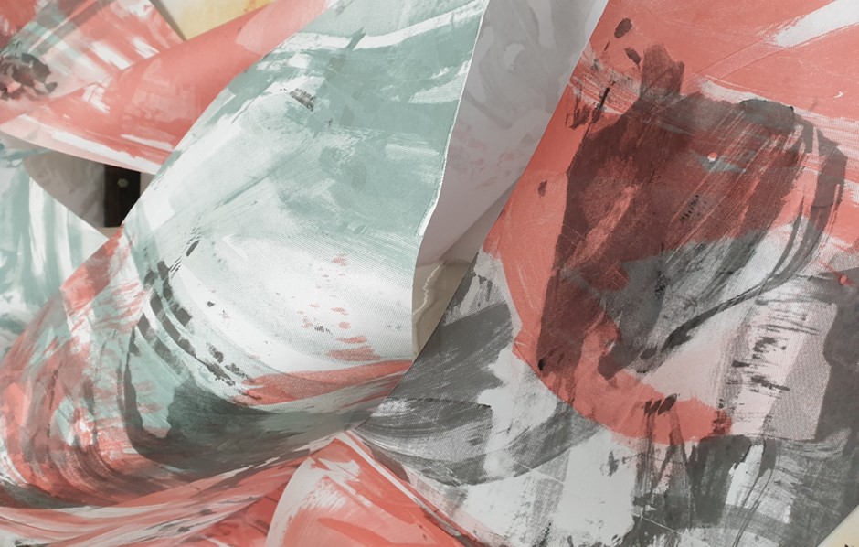
In considering the fading and disappearance of multiple marine and coastal ecosystems I felt more prepared to be led by an experiential process to make increasingly informed decisions from what was happening in the moment and the handling of the materials, of how it felt and made me feel. The merits of exploiting the grain of the sheer muslin fabric was fully capitalised upon through the screen-printing processes involving multiple layers of muslin and blended cotton and linen with the development of prints, imprints, and resist. The overall rationale for colour selection for print was based upon the portrayal of the context and themes of fragility, fragmentation, disintegration, and disappearance. So worn and antiqued versions of colour were sought using a reduced colour palette with one brighter accent colour.
Every decision made reflected favourably upon environmental sustainability and minimising waste, of only using what I needed, of selecting reclaimed materials, of recycling, repurposing, and reusing as part of my creative process. The imagery used always stemmed from nature itself especially natural surface qualities of coastal and marine life which was deeply influenced from early life experiencing. The fragility of the sheer muslin to look at and to touch highlighted this sense of brittleness with its fraying, distortion, and broken parts. I felt that through this process I was representing myself, a significant part of my own identity, of my formative years, the development of my beliefs, my relationship with nature especially my experiencing with the sea and the coast through my family. It felt like a process of remembrance, of times gone by, of family no longer there, of those loved and lost, of changed relating and through the materials a chance of growth and renewal.

From the sampling processes preferred colourways were realised including use of dull yellow, grey-blue and a selection of greys and blues on grey-blue dyed sheer muslin. This colour palette seems to situate naturally with the context, of the sea and the coast and it felt right as it evoked prior experiencing of the sea and the coast with my family, of being a child on the sand and on as well as in the water…the colours resonated with me at a more visceral level, of feeling the same sensations as I worked with such coloured inks on the cloth. As such feelings were reverberated in process it felt right to be led by this going forward so this colour palette was chosen for my final extremely large material pieces.
