
Project Work Investigating and Creating Larger Scale Textural Qualities with Colour Palettes based upon more Worn, Muted and Natural Tones
Conclusion of the Development of my Ideas concerning Environmental Fragility
Narrowing and Broadening my Approach
Final Written and Visual Evaluation of my Printmaking and Tapestry Weaving
Assignment 5 Learning Log in conjunction with my online blog www.weaveprint.com
Gillian Morris Student No 511388
Introduction
On reviewing the work undertaken for assignment four alongside my tutors’ feedback I compiled my response see Tutor feedback response for assignment 4 https://weaveprint.com/2020/10/19/oca-textiles-3-personal-specialism-assignment-four-response-to-formative-tutor-feedback/ . I was able to continue to reflect upon my narrower direction centred upon my relationship with materials based upon environmentally sound creative practice and processes using print and weave. I was encouraged by my tutor to continue to nurture my purely personalised and intimate connection to and with my materials and processes while also continuing to track responses, thoughts and reasoning coupled with ongoing reflective analysis to support my continuing development…which I did. I continued to reuse materials which promoted environmental sustainability and reduced waste to continue to encapsulate related themes of fragility, disintegration, fracturing, through material use and printing ink. The relationship between material, print, imprint, and resist was increasingly investigated on a larger scale to explore the related themes. That said I focused upon developing my creative voice, on capitalising upon what I have learned previously, to utilise my increased understanding of a range of materials to good effect, to use such knowledge of the materials qualities and properties in process to create very personal responses to environmental threat.
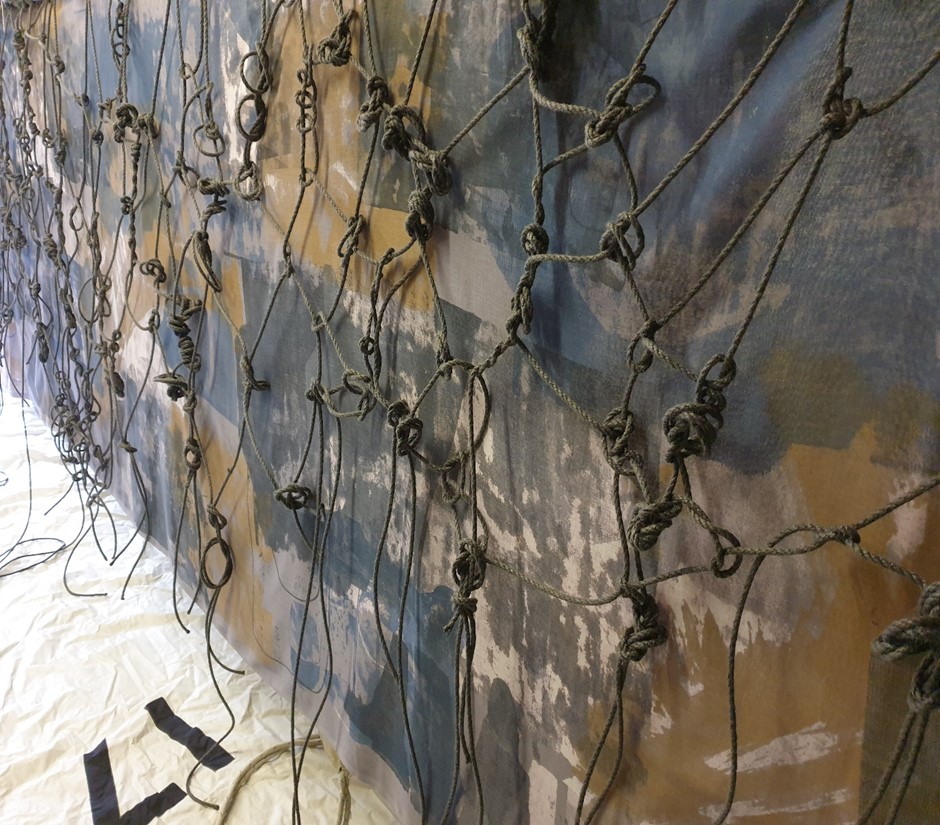
Given the range of prior sampling and related outcomes three major concluding pieces of relational material print and weave work was undertaken which best illustrated where I am and who I am as a textile artist at this time. Passing from Sight which represented Implicit Traces and Imprints of Environmental Breakdown within the Print on Repurposed Sheer Muslin (2 x 1.3 x 5 metres) was accompanied by Entanglement using reclaimed and used black 6mm hempex rope (1.3 x 5 metres) which was completed initially. Thereafter Torn and Ripped Apart Depletion illustrated environmental breakdown through three screen-printed 2ft x 4ft 6mm MDF panels with fragmented and ripped rice paper to recreate the environmental narrative. Disrupted tissue paper was woven onto and around the black tarred marline rope to create warp and weft for this piece. Lastly and more recently Splintering and Shattering Struggle was completed which exemplified environmental breakdown through use of a 4ft x 8ft 6mm MDF panel with related screen-printed imagery along with Resonance-A woven response with ripped and torn scrim.
As stated in my blog entries and my response to such feedback I have increasingly developed deeper relationships with the materials I work with, to be in relationship in process at a deeper level through an extended investigative process to be attuned with heightened degrees of personal engagement and reciprocation… as I relate and respond with the material I am working with I am led by how the material relates and responds back. That said larger scale screen printing with weave has evoked such an emotional connection given the mental and physical engagement which was required coupled with the heighted knowledge and understanding of the material in use.
Screen Printing on Repurposed Cotton Muslin-Refining and Resolving my Print Processes, Techniques, Materials and Colour. See related blog entries.
Through prior sampling I felt that the sheer cotton muslin itself with the materials construction and imagery in print had worked very well to exemplify key themes of fragility, disintegration, and disappearance. I had increasingly realised meaning through the materials and making, of generating a sufficiently positive reciprocal relationship with materials as I recognised a sense of flow and momentum as I worked with the repurposed muslin. The positive outcomes which were evidenced evolved from my respectful handling of the sheer materials being used and printed onto. This analogy of respectful handling of the sheer materials especially the fine muslin directly referred to and with the respectful handling of the environment. Through my creative practice and my work with a range of materials I felt closer to the environment as it informed and defined what I did. Every decision made reflected favourably upon environmental sustainability and minimising waste, of only using what I need, of selecting reclaimed materials, of finding, repurposing, and reusing as part of my creative process. The imagery used always stemmed from nature itself especially natural surface qualities of coastal and marine life. That said the beauty of fragility continued to act as an inspiration for my making, to further cement the fragility of the environment and the fragility of the material and my imagery, to convey the vulnerability of such natural forms, of aspects of natural surface qualities and the creative process.
Through the continuous documentation of my personal response to and with materials I have developed and refined my creative practice with a range of materials including sheer cotton muslin, to work in different ways, to be led intuitively in process by the material. From the sampling processes using screen printing on repurposed sheer cotton muslin (70 x 50cm) I was able to articulate a way forward using this material, to recognise its worth larger scale on two layers, one of print and the other of imprint (1.3 x 5 metres).
From the sampling processes preferred colourways were realised including use of dull yellow, grey-blue and a selection of greys and blues on grey-blue dyed reused sheer muslin. This colour palette seemed to situate naturally within the context, of the sea and the coast and it felt right as it evoked prior experiencing of the sea and the coast with my family, of being a child on the sand and on as well as in the water…the colours resonated with me at a more visceral level, of feeling the same sensations as I worked with such coloured inks on the cloth. As such feelings were reverberated in process I was led by such feelings, of earlier experiencing being re-enacted which informed the decision-making processes, to select this colour palette for these final extremely large material pieces. To continue to work with identity through colour use, imagery from natural marine and coastal forms-art and collage work and increased scale to feel completely immersed and embedded within the making processes. My own formative experiencing with the sea and the coast with its associated felt sense was expressed through the relational choices made in process including the preferred elements of the layered imagery which was utilised throughout this larger scale screen print process.
Given the sheer scale of the material in use I enjoyed the screen printing processes, of approaching this as an opportunity to tell a story through print. As sheer cotton muslin had already been investigated through sampling the properties of the material were already known and understood. That said there were still surprises in just how well the material held the printing ink through both layers in such a large and multi-layered piece of work. The muslin responded remarkedly well with the printing processes despite its overall fragility. There was enhanced imagery, and the strength of the imagery was unexpected due to the heightened qualities of the muslin especially its structural strength and resilience despite its visual delicacy. While I had intended the muslin to fracture and fragment naturally during the print process the material held firm. In respecting the material, making and process itself I went with the material and how it naturally reacted and responded to the tension, pressure, and printing inks. I felt that it would have been disrespectful in this process to then slice the material itself to represent fracturing, splintering and rupturing to symbolise environmental threat and this would not have been conducive to my relationship with the material and how I work with such materials. Instead I continued to emphasise such themes of broken and breaking down through the colour palette, printed imagery and use of imprints. The difference between the printed imagery and imprints highlighted a process of loss and change, of healthy environments to disappearance, fading and passing from sight. The monumental scale generated impact, to develop the narrative, storytelling of environmental breakdown, of using an exceptionally large canvas of sheer repurposed muslin to say what needed to be said visually. Working in this scale with these materials suited the visual account of the connected events of loss and change within our environment, one of disappearance and extinction.

From the development of the top printed layer of muslin including the removal of colour and the addition of white highlights the layers of muslin were separated and the underneath layer with imprints was focused upon. Degrees of contrast were generated with broken parts of imagery printed on top of some of the imprints. The printing ink was used like paint and painted onto the muslin with different tools including paint brushes to achieve different effects. An array of marks was made throughout the five-metre length to express fracturing and splintering, to disrupt the imprint in parts, to evidence increased rupturing and struggle. The increased layering of different techniques on both layers of muslin added depth, dynamism, and complexity within the imagery which was helped through use of hand cut stencilling and masking off of areas to create further interjected, interrupted and disturbed areas of interest within the overall imagery. The imagery evokes a tale of loss and change from top to bottom and across the length of the material…of a story of struggle for survival as the disrupted elements of the imagery overlap in part with increased disappearance through the use of the imprints…fading and vanishing.
From tutor feedback, my ongoing research and critical review including making through sampling processes and interest in extending material use and widening my weaving technique I incorporated weave with print. I researched different textile artists and materials which would best reflect my context for making and what I wished to communicate. As stated previously I was influenced by Susan Beallor-Snyder and her manila rope sculptures to help forge a relationship with larger scale weave to emotionally express struggle through unravelling rope and knotted disruptions. I was also led by the work of Sheila Hicks and her use of materials, monumental scale with threads and connection with the environment. See blog.https://weaveprint.com/2020/10/01/sheila-hicks-textile-artist-anthropologist-capturing-environments-through-the-medium-of-textiles/
In considering this I was fortunate to locate hundreds of metres of used hempex rope which was worn and had faded through use which conveyed age and wear well. I liked the aspects of fraying on the rope which indicated use and its greyish colour which had discoloured through time and reflected the colour palette of the printed muslin.
I sought to respect the material in use to work with the hempex rope to forge a woven piece that encapsulated my theme through how I used the materials and related to the qualities of the rope. Despite its use the hempex rope still felt soft to touch and could readily be tied into a series of weaving knots, especially hitches like the rolling hitch, half hitches, Italian hitch, cow hitch with clinch and Palomar knots. Several knots were used from sailing and fishing to highlight coastal and marine relevance like the bowline, cleat and hoop hitches, anchor hitch, stopper knots and reef knots. I wished to communicate marine and coastal struggle and disruption through the series of knotting within the weave to maintain a loosely constructed weave which was breaking and falling apart and of the strands of rope left dangling unfinished and fragmenting as its overall weave was disintegrating as unable to hold together to be preserved. This idea of disappearance was communicated through the absence of sections, of the mix of areas missing to a myriad of knotting and weave within concentrated sections, of a fragile declining construction barely hanging together.
The process of weaving was extremely liberating with its loose and flowing construction. Although initially I could have readily reverted to a more tightly woven weave, I remained focused upon the context which was helped by being surrounded by sails, a mast and related sailing equipment. I could be more easily emersed within the knotting within the weave as so much around me reminded me of the sea and sailing. It was deeply satisfying being in relationship with the used material, to construct in response to the material in use, of relating and responding with the physical qualities of the hempex rope. It brought back memories of playing with rope in my garden with my father as a child just as my son had enjoyed the same pursuit as a child with his grandfather, of trailing out metres of rope from different boats throughout the years to make all sorts of creations. The knotting process within the weave brought back such positive memories as I touched, held, and pulled on the rope. The physical qualities of the hempex rope with the knotting, twisting, and turning evoked such feelings of strength and resilience, of the capacity for further use, to recover despite age and wear. On handling the hempex rope the importance of reuse was felt beyond recycling, of respecting the rope for its own sake and optimising its own qualities to make with meaning, to continue to create with relevance and understanding through the materials, processes and techniques used. Like Susan Beallor-Snyder and her manila rope sculptures I wished to symbolise emotional expression and disruption through the flowing passages of rope alongside the knotting within the weave and the twists and turns of the hempex rope. See related blog entry. https://weaveprint.com/2020/10/13/susan-beallor-snyder-and-her-manila-rope-sculptures/
Narrowing the Focus through Medium Density Fibreboard (MDF) and Rice Paper-See Blog
Environmental Breakdown Communicated through Meaning and Making- Use of Splitting, Tearing, Stretching, Ripping Paper Foundations with Screen Printed Imagery of Splintering and Fracturing of Natural Forms, Shape, Line and Texture
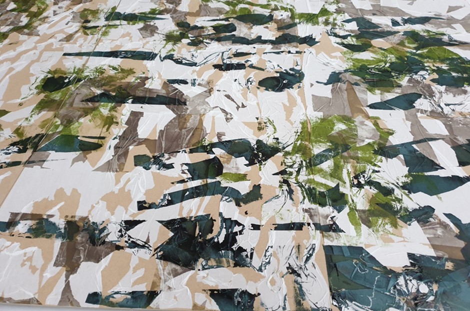
Through the initial A4 sampling processes including the use of different paper types centred upon rice paper, tissue paper, newsprint and resist considerable learning was gleaned which was further exploited in three much larger MDF 6mm panels. From the sampling processes rice paper was selected alongside the preferred colour palette for the larger scale work. Eszter Bornemisza and her work with recycled paper has continued to help me to forge ideas around pulled apart remnants of paper on different surfaces, to play with pressure and tension as well as Val Britton’s use of paper within monumental sculpture. See Blogs.
The use of ripped and torn newprint acted as resist to create increased areas of contrast and interest, to promote the use of texture within the print. Given the detailing created through the paper use, layering effects through resist and colour palettes this was replicated within the larger scale work involving specific weights of rice paper and the dull taupe, chartreuse green and light-mid grey colour scheme. The rice paper out performed the other paper types with its capacity to be distorted, twisted and fratured with wallpaper paste. The feel of the rice paper, its overall whiteness coupled with how well it accepted pressure and the printing inks made this paper the ideal choice for larger scale work.
The dull taupe and light-mid grey printing inks worked particularly well together as both colours accentuated the textural components of the fractured, splintered and split paper with its many folds, twists and torn elements amplified through such colour use. Each MDF panel progressively used less rice paper with more splintering and increased areas of MDF on show to emphasise the context of environmental breakdown, disintegration and disappearance, of decline and loss.
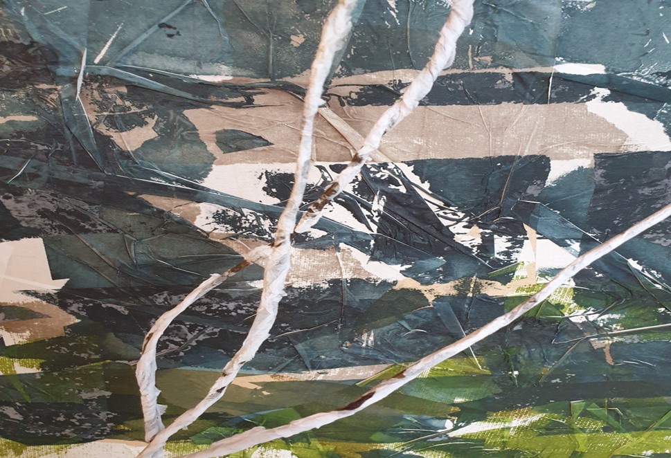
From the screen-printing processes weave was integrated through using the MDF panels, a mix of paper types including tissue paper and the used 3mm black tarred marline rope. I felt influenced by the work of Mira Schendel and her use of rice paper throughout this process. The sheer and delicate white tissue paper was woven round the rope through pulling apart, twisting, ripping, and fragmenting the paper while doing so to expose areas of the rope. The tissue paper was attached through the application of wallpaper paste to the rope. The moulding capability of the rope was further enhanced as the paper naturally dried onto the rope in the open air. The tissue paper was left for hours to naturally degrade and bleach. Both the tarred marline rope and the tissue paper took on an increased sculptural quality and capacity as it inhabited the space. The smooth and greasy eco-friendly marline rope was made from 100% natural hemp flax yarns to seize and serve standing and running rigging and netting on traditional vessels.
That said I felt transported back to being on old well used boats at sea when handling such materials which acted as the core of the weave. With the adhered tissue paper dried there was further breaking down of the paper through scratching and splitting to create further fracturing. Elements of hand printing was applied to the rope, but care was taken to maintain the wear and tear, the disintegrated forms of tissue paper throughout the length of the rope. The tissue papered rope held it shape and form well to act as an accompanying sculptural appendage to the panelled MDF screen through weave, of its purposefully loose and dishevelled construction-messy, unkempt, and disturbed, unravelling like the vestiges of what has been left from marine and coastal waste.
Increased Scale with Medium-Density Fibreboard (MDF) Integrated with Scrim and Weave. See Blog. https://weaveprint.com/2020/11/17/increased-scale-with-medium-density-fibreboard-mdf-integrated-with-scrim-weave-stitch/
Conclusion-Screenprinting on MDF to Reflect Environmental Splintering, Shattering and Fracturing
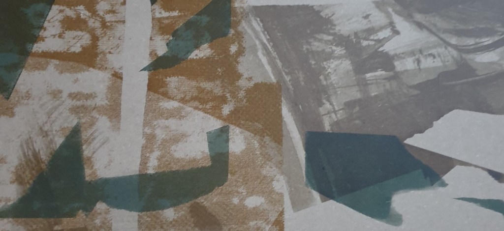

Through getting to know and understand this substrate I felt confident to upscale to a 4ft x 8ft MDF panel as one of my final pieces for the Personal Specialism course. I felt that to do so would generate greater visual qualities and impact given the overall imagery. From the outset I wished to conclude my investigative process with a creative process structured around the struggle for survival. The work of Isa Genzken encouraged me to be bolder and to go bigger to facilitate dialogue and engagement. In doing so I reflected upon a range of ways to express struggle in the visual sense, of the wrestle, scuffle, brawl, and tussle with the need for survival. I related to the idea of different fragile materials splintering and shattering, of materials being under increased pressure and tension as with screen printing processes, of the need to generate imagery based upon ideas of rupturing, shattering and breaking to reflect environmental disruption, of being broken and damaged beyond repair. Some of the screen printing was based upon natural textural surface qualities gleaned from coastal forms using dull ochre printing inks. From then hand cut stencilling was used on a series of blank screens to mask off to create a more dynamic, immediate and personal reponse to what I felt in process with the material in use. I also created a number of screens using newsprint to tear and rip the paper to create sharp, jagged, and raw edges, dynamic shapes and lines which interjected both the exposed imagery of natural textural surface qualities and beyond.
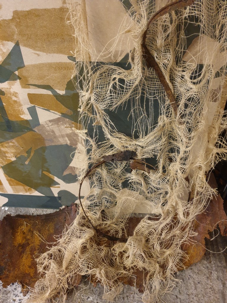
To increase the range of mark making and dynamism resist was used on screens and the MDF to further break up any sense of flow with small squeegee use. Every tear and rip was realised as the range of squeegees in use applied the pressure through the screens. I felt that the hand made stencilling processes contrasted well with the chosen elements of natural textural qualities from the coast. The natural curved lines and shapes juxaposed with the more jarring line and shape which was created by myself as this resonanted more approprriately with the overall context and themes…of natures struggle for survival against man’s destructive encroachment into their habitats especially the marine and coastal ecosystems under ongoing threat. The darker cornor which was printed with a blank partially masked off screen using mid-grey printing ink was created to add specific areas of interest and contrast alongside a backdrop for loosely deconstructed scrim which would act as the base for weave and the use of entangled and unravelling warp and weft from previously worn and dyed knitwear used at sea.
Throughout the screen printing processes I was conscious of my preference to use an aspect of the very large MDF panel for weaving, to create a quality of richness with variety, to evoke a quality of response which resonanted with my context of environmental breakdown and its survival, of my focus to capture this in print and weave. With my own identity based upon the the Scottish Coast and marine environment I found materials which have been used and repurposed from such settings including scrim netting and a worn fishermans sweater which was donated from a male relative. The used scrim netting was already ripped but I pulled apart further strands to degrade and loosen the overall composition, to let the mid-grey screen printed MDF to be seen alongside other areas surrounding this area of focus.
The woollen grey coloured fishermans sweater was ripped and unravelled beyond the ribbed section bottom up to create increasingly dynamic and expressive use of looser weave, of disintegrating yarn bearly held together. I felt that the ripped and fragmenting taupe coloured scrim contrasted well with the grey coloured unravelling wool. While stitching was used this was removed as it seemed to detract from the freedom of the scrim and wool together to avoid any form of restriction and restraint. I felt the process of unravelling mimicked the disintegration and destruction of the environment as sections of the jumper increasingly disappeared from sight. The effects of unravelling as the yarn came apart naturally created entanglements and beautifully formed knitted threads as the wool held on to the shape of the stitching. This then conveyed the stitching I was looking for alongside the woven effects as the remanents of the knitted jumper held its sculptural form. That said the fishermans sweater proved to be indestructable despite years of wear and tear, although every effort was made to respectfully dye and degrade. In considering this additional projects were undertaken to utilise more related elements in line with my preferred narrative and context including found corroded metal objects and repurposed scrim to better convey and accentuate fragility, disintegration and fracturing.