

Every year I look forward to the RSA Annual Exhibition as a major showcase of contemporary painting, sculpture, printmaking, photography and installation. Of particular interest this year was the redivider frieze series by Jim Pattison in acrylic and oil on canvas. The artist employed a range of digital media and technology to manipulate imagery and information through painting and printmaking. I found myself just looking at the complexity of the shapes and colours for some considerable time to elicit meaning and a relationship with the series. I could readily relate this work to textiles and what I aim to do in my textile printmaking work…of the use of multiple forms-shapes, colours and line overlaid to construct dynamic layering effects. The colour range was so impactful…complimentary and contrasting. Such work inspired me to extend my use of painting and collage in my textile practice.
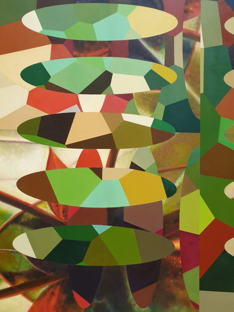
Jim Pattison Redivider (Frieze 5) Acrylic and Oil on Canvas (152cm x 138cm) Myriad of green, mustard, brown and terricotta
Another liked series of paintings was by Andy Stenhouse called Life on Mars 1-4. The artist worked at a viseral level to create a visual language to communicate emotion and to convey a range of conceptual ideas to make philosophical and socio-political statements. The series of four oil paintings just caught my immediate attention as I walked into Gallery five with their vibrancy- use of colour with black as well as a sense of movement with meaning. The way the paint was applied and its composition seemed to take me on a journey to create an emotional response which was hard to move away from. The paintings called for an exacting degree of examination and reflection as I found the need to delve deeper in my analysis of the work.

Andy Stenhouse Life on Mars 1-4 Flocks, Swarms, Shoals (1), In the Garden (2), After the Big Bang: Dark Matters, Evolution, Civilisation on Canvas (3), Social Engineering, New Town (4). Oil on Canvas (100 x 100cm)
I was attracted to the work of Stephen Carley for his use of mixed media to create a cohesive artwork based upon materials, process and context. The shapes and colours used especially yellow provoked looking and a response. The artist has focused upon poor materials often discarded as deemed useless and he has reconfigured their use and usefulness. I liked the concept of refunctioning and re-envisioning waste to art, from materials not considered or valued to art that’s stared at and admired, thought about and reflected upon. The art confronted and demanded attention through such mark making and left a mark. I have widened my consideration of what constitutes art materials and aim to experiment more with a wider range of materials not previously looked at.

